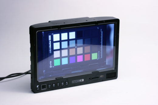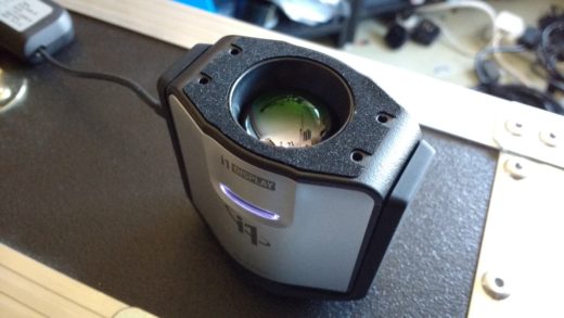
Recent news concerning the highly colour accurate display hardware in certain consumer electronics devices has caused some excitement. Some of this new equipment is comparatively cheap, very portable, and, best of all, you can play Cat Museum on downtime. Given the growing interest in cloud-everything, the ability to casually glance at material from the internet on an accurate display is exactly the sort of thing that gets breathlessly described, on trade-show hoardings, as “life-changing.”
The extent to which this actually changes anything is dependent on a lot of factors. The psychophysics of human sight are one, but others include much trickier, harder-to-solve issues of profit-motivated self-interest and the film industry’s equivalent of office politics. The result can be difficult phone calls about how the dailies look in a situation where the light coming out of two displays is actually very similar.
No technical solution
Sometimes, then, these are not problems we can solve with technology. We can (and absolutely should) build and maintain monitors that emit colours very accurately, but what they look like to humans is a much less consistent, messier reality. One interesting commentator on this was Edwin H. Land, who wrote in the 1960s about what he called the retinex theory of colour vision, a word chosen to emphasise that both the retina of the eye and the visual cortex of the brain have at least equal influence over what things look like.
Land was seeking to explain how humans continue to perceive coloured objects as consistently coloured even as ambient lighting conditions change, something known to science as colour constancy. It’s a complicated question for field monitoring, given monitors emit their own light which doesn’t change as the environment changes in the same way reflected light from a surface does. The whole thing raises some interesting speculation about why we assiduously white balance cameras, but we make no attempt to white balance monitors to the surrounding environment.

In practice, most people don’t seem to have too much trouble isolating their sense of colour constancy to a rectangle in their field of vision, but field monitoring has always been beset by other issues that aren’t in any sense fixable by engineers. The euphemism “on set” might mean anything from “in the DIT tent all day” to “I’ve just walked into the DIT tent from a forty-five minute lunch break in a sun-drenched parking lot.” Anyone who’s worked on a greenscreen stage will be aware how the world looks magenta for a second or so after turning away from a view that’s largely chroma green. Issues of brightness and contrast are subtler and longer-lived, and it’s well known that the ability of humans to remember precisely what colours look like over even a few seconds is never great.
The reference on this is probably Jonathan Flombaum, an associate professor in psychological and brain sciences at Johns Hopkins, whose research interests are listed as visual attention, working memory, and cognition. A paper by Flombaum and Sarah Allred suggests that people are very bad at remembering colours when they’re not seen side by side, and, perhaps worse, have an improved ability to remember certain colours over others. What that means is, in short, we’re quite likely to assume that a yellow near our favourite yellow is miles away from our favourite yellow, even if it really isn’t. Our colour perception is perhaps distorted by experience as much as it’s improved by experience.
Try harder, then cry some more
Does this all make at least something of a mockery of our rather touching attempts to show each other colour accurate pictures that we can all agree on? Well… yes, it does, at least in part. We should, obviously, aim to have correct monitoring so that any errors introduced by our inevitable human frailties are at least centred around the truth, but much bigger errors exist in human perception than a lot of people want to admit.

Experienced people can take some solace in a 2020 paper by Maryam Hasantash and Arash Afraz titled “Richer color vocabulary is associated with better color memory but not color perception.” The study discusses how the manner in which we talk about colour affects the way we remember colours, or at least how we differentiate colours. Human languages don’t all have names for the same colours. Famously, the Japanese character 青, ao, is used as part of words which mean both “blue sky” and “green traffic light,” which might explain why many Japanese traffic lights have a rather turquoise filter where we might expect a nice kelly green.
The vocabulary study suggests that people who habitually use a lot of different words for a range of similar colours are often better at remembering what hues in that region of the spectrum look like. It doesn’t really discuss whether that can be trained, per se, although it might be a reasonable suspicion. Perhaps the most worthwhile conclusion is, as so often, that these new, colour accurate consumer displays are a good and useful thing, but terminology such as “revolutionary” and “world-changing” and “epoch-making” are probably best reserved for advertising copy.

Filmtools
Filmmakers go-to destination for pre-production, production & post production equipment!
Shop Now


