There’s no such thing as a reality show, only unreality shows. The more unreal, in some cases, the better.
Back in the early 2000s all of my corporate clients went on a “reality” kick. “Don’t use any lights,” they said. “We want the look to be ‘real,’ as if our employees had shot this.” I was baffled: why hire me if you want your project to look as if it had been shot by my mom? I lost a couple of clients because I just couldn’t bring myself to make it look as bad as they wanted. (I’ve shot projects that are specifically meant to look amateurish because that suits the product or the message in some way, but it was odd to me that so many companies opted to brand themselves using badly shot video.)
Over time, many companies lost their brand identity because all of their media looked amateurish. There was no way to differentiate between them visually. It was as if every company changed its logo to Helvetica text in black-and-white.
Now I shoot for clients and companies who want very strong visual brand identities, as they understand that the look of their media reflects who they are and what they sell. Some of these want to push limits: it’s not unusual for me to shoot with anamorphic lenses, or ancient lenses that have been rehoused for modern use, or use obscure streak and diffusion filters. Now it’s about grabbing attention using cool images that immediately set a tone and create a visual brand for that client. Back in the early 2000s, one of my clients at the time (a major apparel company) conducted tests to establish what kind of media best communicated their brand identity. Video won, hands down.
In print, fonts and colors establish a brand. In motion, lighting, composition, color, sound and editing distinguish one company’s offerings from another. We do this by manipulating reality to reflect the brand’s message. We don’t show reality, we shape it.
Reality is often ugly. We generally don’t notice this because we’re surrounded by it, and we’re not focusing on any one aspect of it. We exist in an environment, and 3D space taps into different aesthetics than does a 2D image. Once we put a frame around reality, though… we’re immediately making an artistic statement, and that statement cascades and has consequences. Suddenly the lighting within the frame makes a difference. Depth of field makes a difference. Exposure makes a difference. Color makes a difference. Sound perspective makes a difference. Art direction makes a difference. Makeup and wardrobe make a difference. As soon as we draw someone’s attention to a specific aspect of the world… as soon as their view narrows… what is in that view becomes part of a story. And audiences rarely want that story to make sense.
I guess what I’m saying is: reality sucks. Human beings don’t particularly like their stories told realistically. We want to see interpretations of reality, not reality itself. What I’ve described above is shaping reality to sell a product, but traditional stories shape reality to make a point, follow a theme, show how characters change over time.
Sometimes brand and storytelling overlap. Back in the 1940s/50s each studio was known for its “look.” Some dictated bright images with perfectly-lit stars, others allowed their directors and DPs to go a bit darker and grittier. One remnant of this remains in the form of the “Warner Brothers haircut,” where closeups are tight enough that framing for the face crops out the top of the head.
Creating looks that tell stories is what we do. Often these looks are subtle, but occasionally they aren’t. It’s fun to see what filmmakers can get away with artistically when they toss subtle out the window. The farther one moves from visual reality, the more abstract and bizarre the storytelling can be.
To make my point, I want you to go take a look at something really weird. Click here and spend 15 minutes in surreal goodness. I’ll wait.
I don’t know what you thought of that, but I freakin’ love that stuff.
I first heard of Canadian director Guy Maddin when my husband took me to see The Saddest Music in the World. I assumed it was going to be deadly dull and overly romantic, but it turned out to be completely surreal and visually “over the top.” It was also hysterically funny, with a lot of the humor coming from the juxtaposition of the visual style and the subject matter.
Best of all, it looked like a 1920s hand-cranked silent film, but with sound and occasional color. The story was so “out there” that the extreme visual style made it believable in a way that reality never could.
https://www.youtube.com/watch?v=gsc4Ysc0G1s
This is an extreme example, but it shows how the visual style of a film (or any media) dramatically impacts how its subject matter is taken, and whether the subject matter works at all. It especially affects whether the subject matter is memorable.
What triggered this article in the first place is that I found a recent Guy Madden film on Netflix that I hadn’t known existed. I had no idea what to expect when I wandered into The Forbidden Room, but it was quite an experience—and a great lesson in how visual style can advance, enhance, and make us believe stories that would otherwise seem completely nonsensical:
https://www.youtube.com/watch?v=pwKvz-wA3I0
Apparently this film came about as a result of the Seances link above. While shooting the scenes necessary to create the unique films on that website, the filmmakers realized they could also shoot enough material for a feature film. They found the synopses for 17 films, ranging from educational films to feature films, whose footage had been lost to time, and then tried to reimagine what they might have looked like. Segments from each film are stitched together like nesting dolls: an educational film on the subject of bathing becomes a submarine adventure as the camera descends into the tub; a film about a woman who falls asleep while being held captive in a cave dissolves into the story of a lounge singer stalked by African jungle vampires .
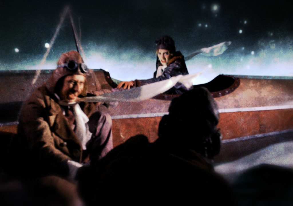
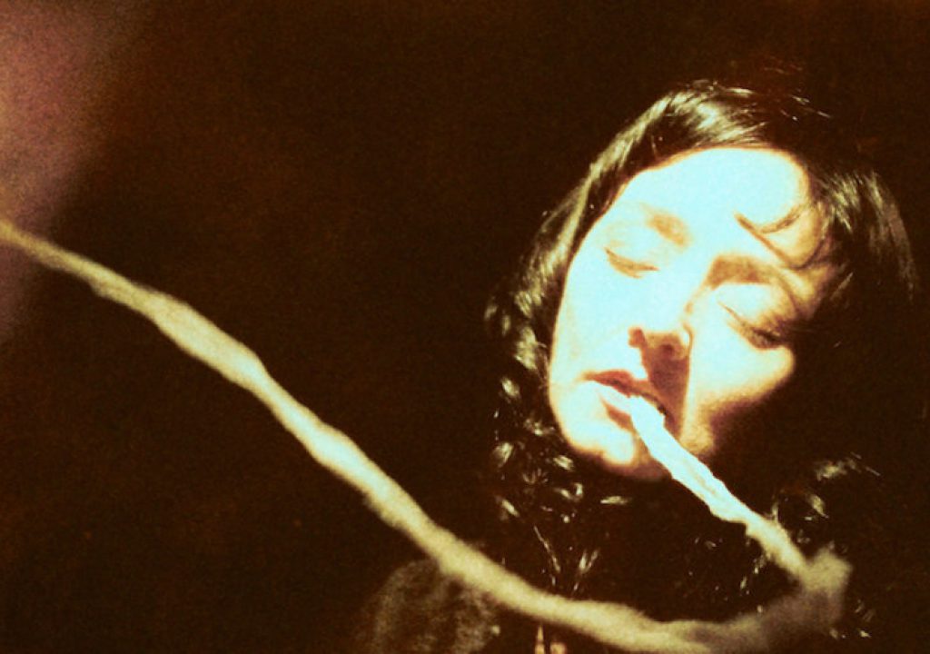
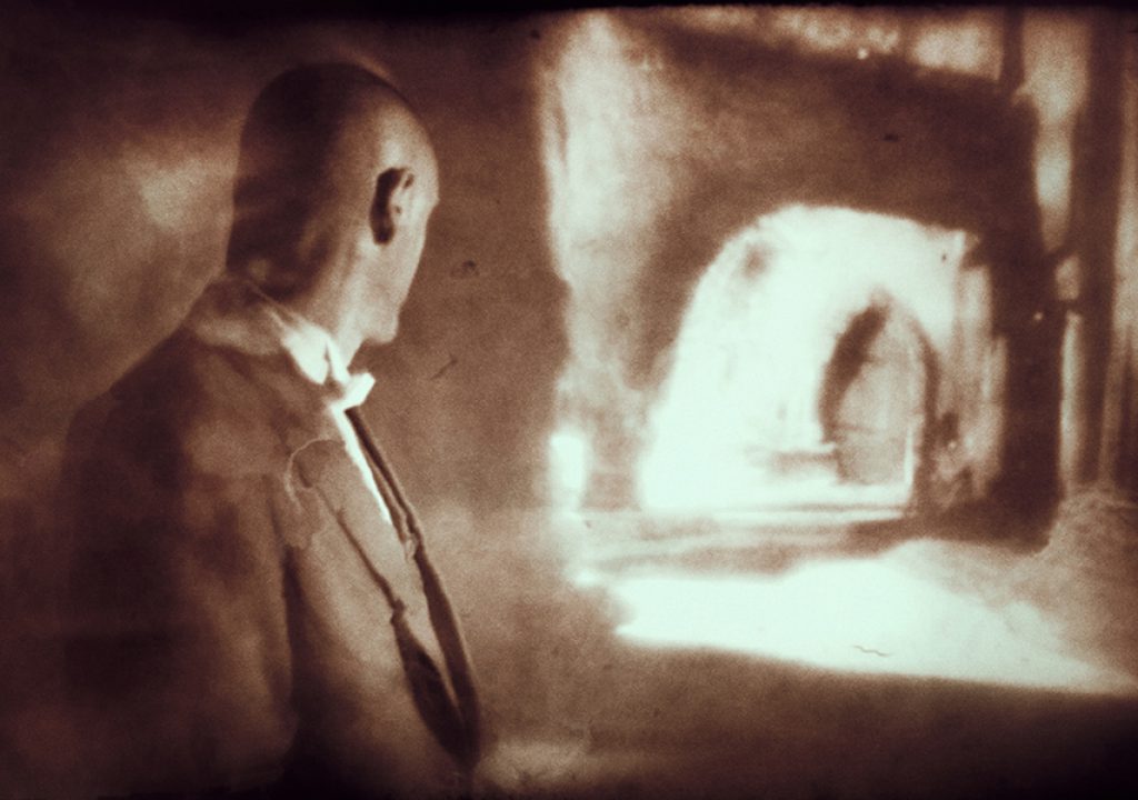
Each story has its own unique visual style, varying primarily in color, texture and camera movement. The lighting changes somewhat as well, but the key light is often hard and visibly moving. (An article on the film states that a lot of it was illuminated by a fresnel that was set on full spot and held on a stick above the camera.)
Each story’s subject matter is completely surreal and implausible, and yet the visual styles are so abstract that we buy into each storyline without much thought beyond, “Wow, this is out there!” Just as the script is unreal, so is the lighting and the camerawork.
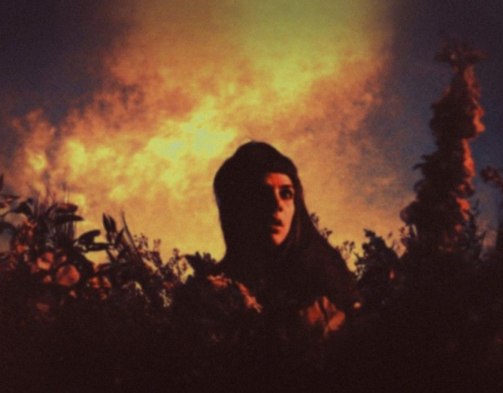
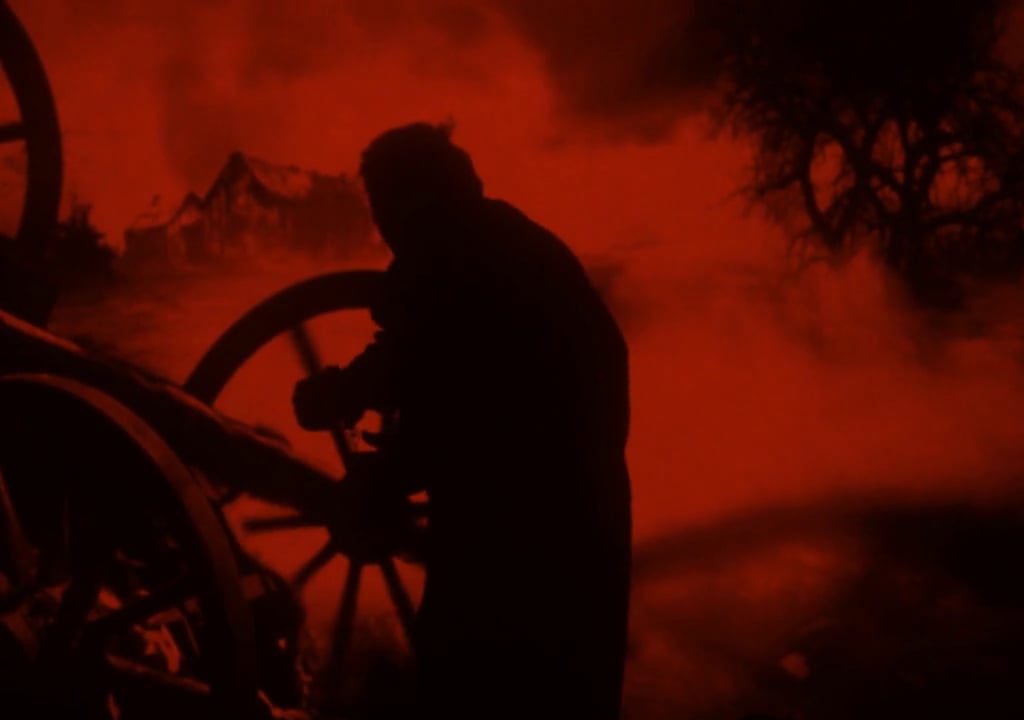
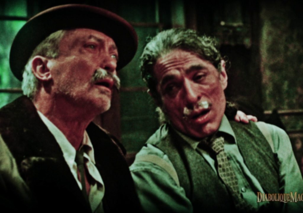
Take a look at a few stills from the movie. None of them are particularly realistic, but each tells a story on its own.
Each “film” in The Forbidden Room is completely absurd. That’s the fun of it. But each film also has its own look that feels like a throwback to a past era when the look of film itself was more obviously removed from reality. Those looks set the stage for the filmmakers to push reality farther and farther away, and get away with it.
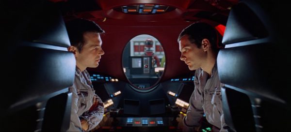
Many filmmakers craft their own realities that allow them to tell the stories that they prefer to tell. Sometimes they use the same techniques for different results. Stanley Kubrick loved single-point perspective and used it to tell some very dramatic stories:
Wes Anderson uses single-point perspective to tell brightly-colored children’s stories for grownups:
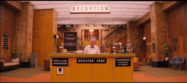
Both directors tell very different stories, and yet this type of framing is an integral part of how each does so. It is part of their “brand.” This kind of framing and staging is completely unnatural, but that unnaturalness is how they prefer to interpret stories for their audiences.
You won’t have any doubt as to when you’re watching a Guy Maddin film. His style is unique in that it is completely unrealistic, but largely based on the lack of realism found in films made when the medium was very, very young.
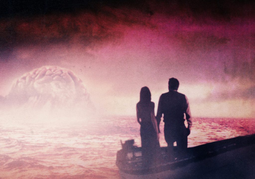
Audiences love all of these looks. Reality is a lot more interesting when viewed through an artist’s eyes.
Early films were shot in black and white and primarily lit with hard light from above. The look was unnatural but that abstraction gave artists room to construct the visual reality that best suited the story. Color introduced the opportunities for new layers of abstraction, from the mundane (blue moonlight) to the hyperreal (silvery cyan moonlight) to the impressionistic (purple moonlight from “One from the Heart”). Since then we’ve seen a return to grittiness, hyper realism, naturalism, more abstraction, and the current trend for what I call enhanced realism. The trend, though, seems to be toward abstraction, as the cleanliness of digital imagery, and the opportunity to experiment with vintage looks afforded by apps like Instagram and Hipstamatic, push us to interpret imagery more strongly than in recent memory. I regularly shoot projects with vintage lenses or through funky diffusion materials, and most recently I shot a project on Master Primes at T1.3 in order to turn backgrounds into expressionistic washes of light and color.
I’m perfectly happy to head in that direction. It’s addicting. And when I see images like those above, my fear is that I may not have the chance to push my work that far. The Forbidden Room is, ultimately, an art project, and I make my living shooting commercial projects. It’s hard to push companies into taking chances like these with their brands. I see this happen every once in a while, but not often. Still, given the move toward using older lenses and generally “messing up the image,” I hope to be able to do work like this someday.
After all, those of us who become cinematographers don’t typically become such in order to capture the world as it is. We want to put our spin on it. That, after all, is what stories are: events shaped by perspective.
Our perspective.
Filmtools
Filmmakers go-to destination for pre-production, production & post production equipment!
Shop Now