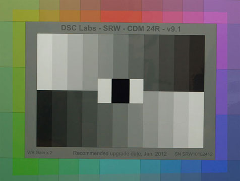
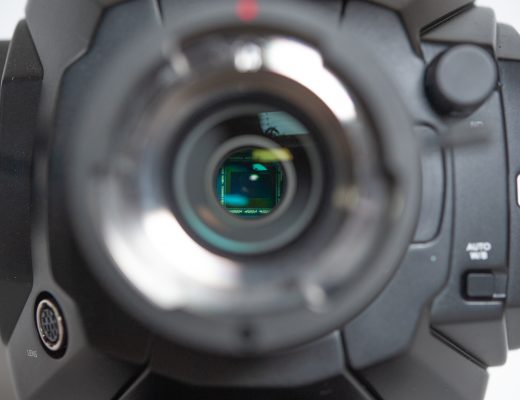
Accurate color and pretty color are not always the same. Let’s compare two Canon C300 color matrices and see for ourselves…
Every camera, and every manufacturer, has its own “look.” Part of this is how the sensor is constructed, in particular what specific filter colors are used on the red, green and blue photo sites; another part is how that company’s color scientists use math to conform those rough color signals into imagery that is not only beautiful but that brands the camera as being from that manufacturer. Sony cameras have a look, as do cameras from Arri, RED and Panasonic, and while those manufacturers give us enough control to change those looks significantly the base looks are uniquely theirs. And, to some degree, you can’t get away from those base looks completely: there will almost always be some telltale indication in the image that may tell educated viewers what piece of machinery sits behind your carefully constructed imagery.
My last article about Canon’s color science was sadly devoid of pictures. The project I was shooting when I experimented with looks is, for the moment, top secret, so I can’t show you anything from it… yet. I did find some charts that I shot earlier this year with a new Canon C300 when I did some testing at a local rental house, so I can give you a quick example of what I’m talking about using those.
Note: These charts were shot using Canon’s original camera software, which I believe has been updated. The update apparently solved the white balance issue that I wrote about here, so there may have been other changes since. In particular I see that the EOS Standard matrix doesn’t quite hit vectorscope targets cleanly, which is different from what I saw when I gave waveform/vectorscope demos at NAB in the DSC Labs booth using an updated C300.
Here’s a comparison of Canon’s Cine1 matrix, which is meant to emulate a film look when the final deliverable is video, and the EOS Standard matrix, which is meant to match EOS still camera colorimetry:
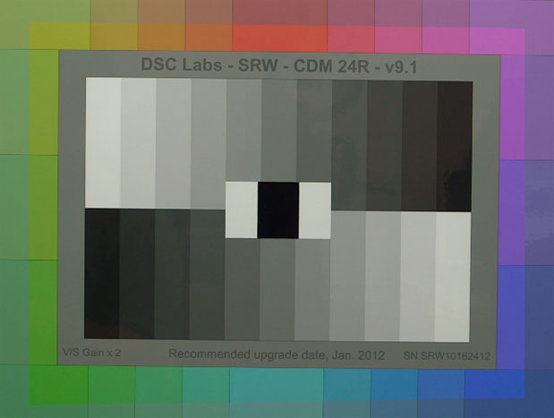
Outside: Cine1 matrix, Cine1 gamma. Inside: EOS Standard matrix, Cine1 gamma.
Note that while I use the Cine1 gamma for both settings this doesn’t substantially change the color response: although the matrices and gamma curves share names, they can be used interchangeably to create different effects because they affect different aspects of the image. (To explain this in coarse terms, gamma curves only affect contrast while matrices only affect color. It’s unfortunate that they share names.)
There are two things I see when I look at this:
EOS Standard is way more saturated and color accurate, if we compare it to the Rec 709 standard.
Cine1 is much less saturated than EOS Standard, and the greens tend to have a lot of blue in them which makes them appear less bright and saturated.
There are aspects of each of these matrices that I like and dislike: I tend to like more color accurate hues, but I also like them to be a bit desaturated as well. Bright colors bother me. I like the accuracy of the EOS Standard matrix but the Cine1 matrix’s lack of saturation.
We’ll take a look at these two matrices at roughly the same saturation level in a moment, but first let’s look at how they differ. That’s easier to see when their saturation levels are dramatically different:
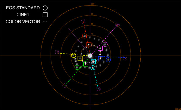
Outer colors are EOS Standard. Inner colors are Cine1.
Saturation is measured by how far out colors fall from the center of the vectorscope. We aren’t too concerned about that now as I want us to look instead at color accuracy. That’s defined by whether the colors call on the vectors (or lines) drawn from the center of the vectorscope through the color boxes. In theory perfect Rec 709 colors will fall into the boxes, but it’s impossible to print colors that saturated so the DSC Labs Chroma du Monde chart that I’m using is printed to be 50% saturated. If we were trying to get the colors in the boxes we’d set the vectorscope for 2x gain, but right now we’re just looking at where they fall in relation to their vectors so the gain is set to 1x.
Starting with red:
RED: EOS Standard red is a tiny bit orange, as it falls slightly on the yellow side of its vector. Cine1 is very slightly too blue, as it falls on the magenta side of its vector.
YELLOW: EOS Standard is a tiny, tiny, tiny bit green. Cine1 is very green.
GREEN: EOS Standard is a little too yellow. Cine1 is a little too blue.
CYAN: EOS Standard hits cyan dead on. Cine1 is a little too blue.
BLUE: Both matrices match but make blue a little too green.
MAGENTA: Both matrices match but are equally too blue.
This is a little different than what I saw at NAB, when EOS standard hit the Rec 709 vectors perfectly but Cine1’s red was too yellow and it’s green was too blue. I’m not sure if that’s the result of different lighting conditions or a software update.
For closer comparison I’ve increased the saturation of the Cine1 matrix to try to match the EOS Standard matrix:
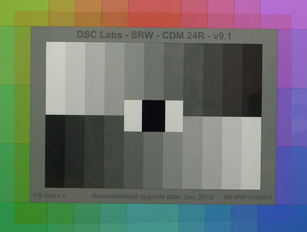
Outside: Cine1 matrix, Cine1 gamma. Inside: EOS Standard matrix, Cine1 gamma.
It’s interesting to see the differences. The saturation match isn’t perfect: the blues line up pretty well but nothing else does. Still, it’s interesting to look at the vectorscope image above and see if it predicts what we’ll see by eye.
Here’s what happens when I try to match EOS Standard’s saturation to Cine1:
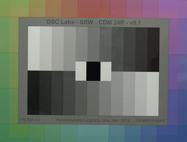
Desaturation hides a lot of color sins. Still, I think I like the desaturated EOS Standard colors a bit more. They seem a bit more accurate. Cine1’s blues might be more pleasing as some of the prettiest blues have a bit of green mixed in, so there might be occasion to exploit that look. The greens disappoint me a little as they are a little muddy and blue, but while shooting a spot last week on a grassy field I discovered that blueish green grass was less distracting from the subjects than bright green grass. I opted for real green grass instead of blueish grass on this particular project, but I learned a valuable lesson for the future that may help me in a similar situation.
Charts are valuable for technical analysis, but in artistry takes precedent in the real world.
The one color that Canon nails in every matrix is flesh tone. This chart doesn’t have flesh tone patches but my experimentation at NAB showed me that they put flesh tone accuracy ahead of any other color. That’s important, because that’s one of the few colors whose accuracy is somehow lodged in our brains. If flesh tone is wrong we’ll notice very quickly that something is wrong, and Canon does it’s best to make sure that doesn’t happen.
There’s one more thing I think I discovered while playing around with these charts. Nearly every camera undersaturates cyan: it’s the one color that never really comes close to the Rec 709 box and usually falls short of all the others. I decided to do a little research and try to figure out why that is. I came across this chart of Rec 709 color response curves and added a couple of notes of my own:
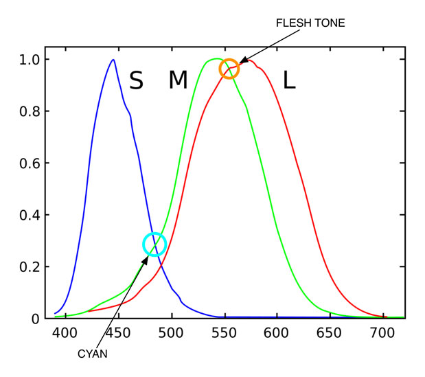
Rec 709 colorimetry attempts to match the color response of the average human eye, and these curves come close to representing the short (S), medium (M) and long (L) wavelength cones that are key to our color vision. As you can see, the M and L cones overlap significantly, and they intersect most strongly just about where flesh tone falls. This is probably why we’re so sensitive to flesh tone color, and certainly why Canon makes it such a high priority. What’s more interesting, though, is how little overlap there is between the S and M cones, where cyan occurs. If there’s one color we’re probably least sensitive to it’s like to be cyan.
If the average camera’s color science tries to come as close to this model as it can then it’s no wonder that cyan is never a very saturated color: how can we make it more saturated when there’s not much of a signal there to begin with? If this is how the filters on the sensor’s photosites react then there’s never going to be much a strong response to the cyan portion of the spectrum. (Although cyan light can be created by mixing blue and green light, this only works when looking at emissive light: a blue and green light placed close together will be fused by the brain into a single light that appears cyan. Most of what we see, though, is reflected light, which means that a cyan object has to actually reflect light in the cyan portion of the spectrum in order for us to see it as cyan. According to this graph that’s likely to be around 480nm.)
Making cyan look more saturated can be done by increasing the saturation of the camera’s M and L curve response, but then green and blue will look crazily saturated.
I’m fascinated by color matrices, both for the opportunities they offer me as a cinematographer and as a look inside the collective mind of an imaging device manufacturer. Ultimately, accurate color and pretty color are completely different things, and as long as colors like flesh tone appear to be accurate other colors can be manipulated dramatically to influence emotions without the audience consciously noticing.
If you want to learn about matrices, play around with them while looking at a color chart. If you want to learn about manipulating emotions through color, play around with matrices while looking at a real setting. While objective science is helpful it must be subservient to emotional storytelling.
Note: I have worked as a paid consultant to DSC Labs.
Art Adams | Director of Photography | 10/28/2012 | www.artadamsdp.com

Filmtools
Filmmakers go-to destination for pre-production, production & post production equipment!
Shop Now