Sometimes you set out to answer an easy query and wind up questioning fundamental assumptions. Playing with test charts shouldn’t trigger an existential crisis, but you never know…
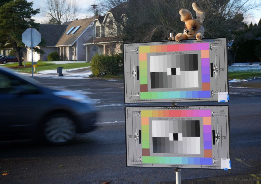
Recently the folks at DSC Labs asked me to test an experimental color chart using a new surface finish. Their simple question: are the colors on the new chart the same as on the old chart, or different?
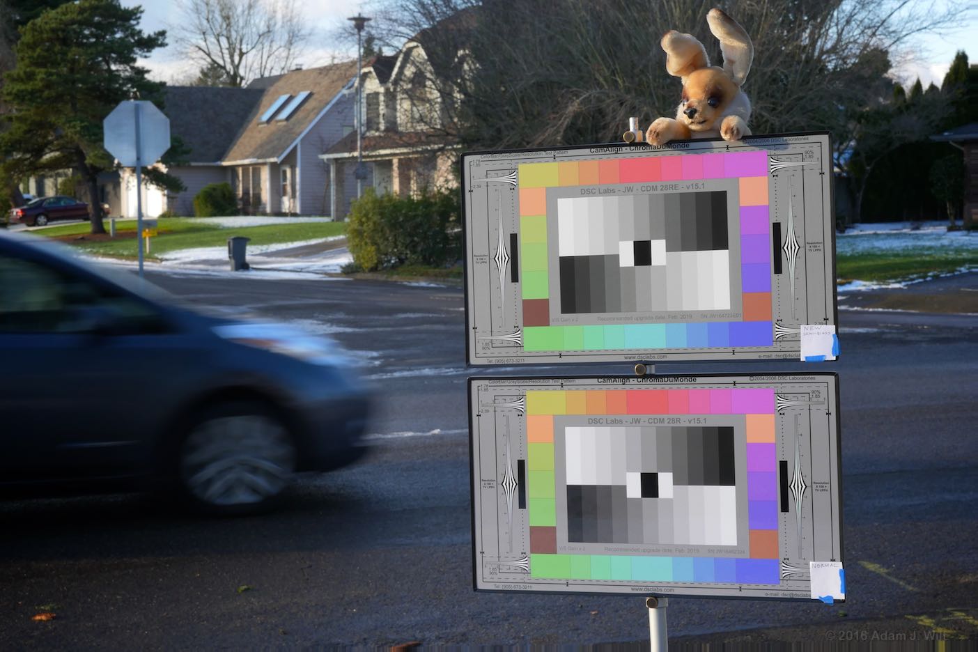
At first, that sounds like a trick question, like “what color was George Washington’s white horse?”, but it’s not quite that easy.
The color you see on a DSC Labs chart isn’t just the color of the pigment used to reflect that color, it’s the color of the light passing through a surface coating, hitting that pigment, and then passing again through the surface finish. That protective top coat acts as a filter, however subtle, and it affects the color seen by the eye and the camera.
Additionally, any pigments used have to be chemically compatible with both the printing medium or substrate and the surface coat; they have to be stable and fade-resistant; they have to be compatible with the printing process used to make the chart.
A given color chip—magenta, say—used on the current charts may look quite different when placed beneath the new chart’s surface, or it may react chemically with the new surface, or it may prevent the new surface from bonding to the chart in the first place. Thus the choice of the new surface material, intended to improve the usability of the chart, necessitated reformulating the pigments and mixes thereof, so that the new chart would look just like the old chart.
But here’s the rub: while the new color formulations match the existing colors spectrophotometrically, they don’t necessarily match on-camera.
Making test-chart colors
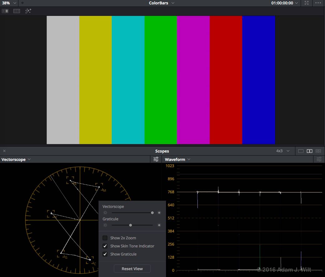
What does it mean to have a “correct” color on a test chart in the first place? When you’re generating RGB electronic signals, you can easily specify RGB=0.75,0.0,0.75 (in normalized values where 0.0 is 0% and 1.0 is 100% brightness) for a 75% saturated magenta. Indeed, that’s how 75% colorbars are generated: 75% amplitude values for red, green, and blue are taken singly and in combination to make up the three primary and three secondary colors which plot the familiar hexagon on a vectorscope:
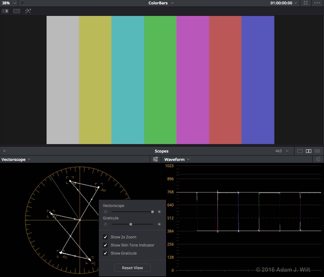
75% colors, however, are far more saturated than most colors in the real world, and many 75% colors are hard if not impossible to reproduce using reflective media. Thus “half saturation” colors are normally used for reference colors on calibrated color charts, at least by DSC Labs and Gamma & Density; setting your vectorscope gain to x2 puts half-sat colorbar colors right back into their vectorscope targets.
Edit: I don’t know whether the Gamma & Density colors are calibrated to hit their targets at x2 gain, or just to align along the correct hue vectors. G&D’s online documentation isn’t clear on the matter, but implies the latter. I don’t have a G&D chart handy to test myself so I can’t really say one way or the other.
By the same token, the RGBCMY patches on a ColorChecker Passport Video are claimed to align with colorbar color hues, but not saturations—and that seems to hold, roughly speaking, in my tests. It’s more difficult (read: expensive) to manufacture colors calibrated to reliably hit the vectorscope targets in both hue and saturation than to make colors that simply fall along the right hue vectors.
Target-hitting chart colors are important if your goal is to align cameras to consistent broadcast specs: you want each camera in your operation to match other cameras so that ENG pix match newsroom pix, and local material intercuts well with network feeds.
A half-sat magenta can easily be electronically constructed as RGB=0.375,0.0,0.375. Other combinations work, too, like RGB=0.75,0.375,0.75, which gives a brighter image overall:
Now you have an electronic definition of your half-sat magenta, all you need is a way to relate that to a printed color on a chart. Fortunately there are equations to map sRGB to CIE xyY and back again, and you can even run those conversions online. True, Rec.709 uses the sRGB primaries but a different tonal curve, and Rec.2020 uses wider-gamut primaries, so you may need conversion matrices between their RGB values and sRGB values like those from this handy calculator. But, once you’ve worked through the math, you’ll have a set of CIE (1931) x,y coordinates to represent your color, like 0.358,0.238.
0.358,0.238 is a rough approximation of the CIE x,y coordinates for sRGB’s RGB=0.75,0.375,0.75. For the purpose of this discussion I’ll use those as the “correct” x,y pair for our ideal half-saturation magenta color.
You can then pop down to your local paints’n’pigments purveyor and ask for half a pint of 0.358,0.238 in high-wear exterior gloss… and get a blank stare in return. No, what actually transpires is that you mix up a batch of colors, checking as you go with a rather pricey precision spectroradiometer like one of these until you’ve got something close (DSC says: “We have more than one high-end spectrophotometer, closer to six or seven, which enables compensation for variability”).
You then glop it on your substrate via whatever method you’ll use to manufacture charts, let it dry, add any surface treatment or coating, and then see if—or, more likely, how badly—the color has shifted. Go back and do it again, and again, and again, until you’ve got a color that hits the numbers:
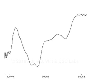
Repeat as needed for each color on your chart: from six for the most basic colorbar colors up to 28 for the full ChromaDuMode 24+4 series. And that’s just the initial setup: you’ll have to maintain those colors consistently throughout your manufacturing process, a process nearly as difficult as finding the right colors in the first place.
That’s why you buy color charts instead of making your own. By the time you’re done getting the tools and mixing the colors and running through all the iterations to get everything correct, your saving will be depleted, your partner will have left you, your pets will have died, and your children will have grown up as complete strangers, and probably become mass murderers, cannibals, or talk-radio personalities.
Perhaps I exaggerate.
But not by much.
Changes beget other changes
Now, change some part of this process, like the surface treatment, and you’ll get to start all over again. In the case of the “AccuFlect-2” surface, a different mix was needed to get the same CIE x,y result on the spectroradiometer:
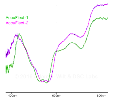
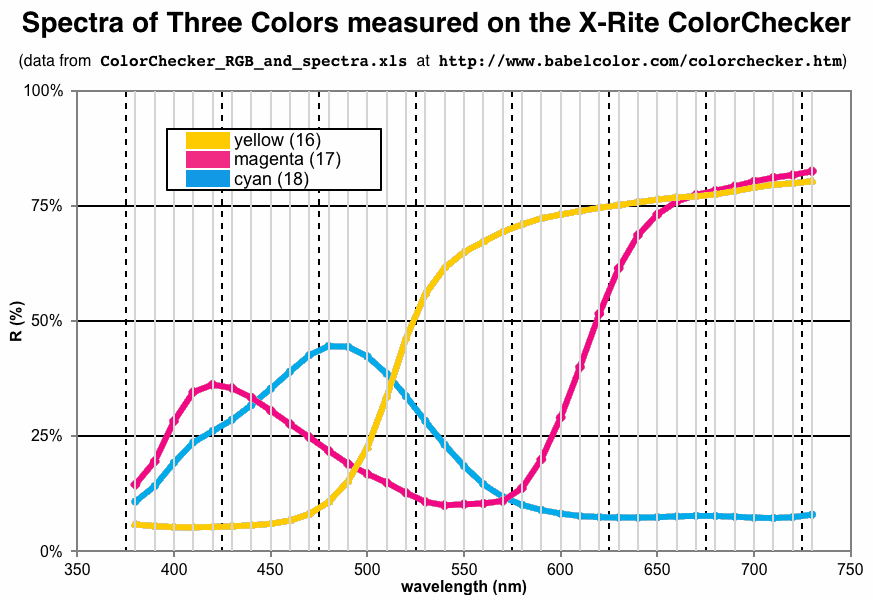
But wait, you grumble: those aren’t the same color at all. You’re right! They’re not. Pigments are messy, broad-spectrum things, and mixing up a color in physical pigments isn’t guaranteed to give you a smooth, well-defined spectral power distribution (SPD). All you’re aiming for—all you can aim for, realistically speaking—is to make your color hit the desired CIE x,y coordinates. And indeed, I’m told that both those curves read the same to the spectroradiometers that DSC uses for chart design, testing, and quality control.
But just because the colors read the same on one precision spectroradiometer doesn’t mean they’ll read the same on-camera. For that matter, there’s no guarantee that they’ll read the same on a different spectroradiometer; when I tested multiple color meters, the two spectrophotometers (diffuse, incident-light counterparts to reflected-light spectroradiometers) often disagreed on the numbers despite capturing comparable SPD curves.
The tests
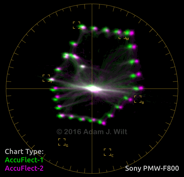
DSC Labs sent me two ChromaDuMonde 28R charts, one with the current, glossy AccuFlect-1 surface and the other with the new semi-gloss AccuFlect-2 surface. With the kind assistance of Portland’s Koerner Camera, I photographed both charts with six different cameras: 3-chip cameras from Sony and Panasonic, and 1-chip cameras from Sony, Canon, Arri, and Panasonic.
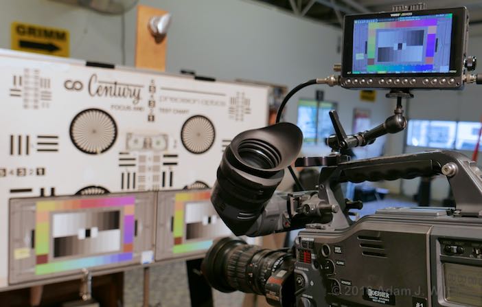
The charts were mounted side by side and illuminated with a tungsten fresnel. Each camera in turn was set up and white-balanced on the normal AccuFlect-1 chart. No attempt was made to reset matrices or select a specific color palette on any camera. Exposure was set to put the crossover on the chart at the 50% level on the WFM, and a short clip was recorded on a PIX-E monitor/recorder. The camera was then aimed at the new AccuFlect-2 chart and another clip was captured.
All clips were brought into DaVinci Resolve and their gains adjusted to ensure the grayscale crossing was at 50%. No attempt was made to adjust color; points on the vectorscope fell wherever they did as the camera saw fit to render them. A power window was applied to neutralize (desaturate) any color outside the pattern, such as the yellow post-it note labeling the camera used, and blue painters tape on the periphery of the charts.
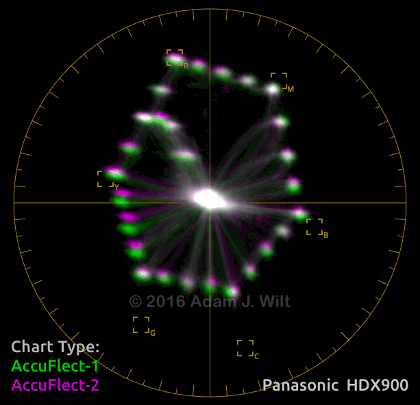
I then captured the vectorscope image for each test, and superimposed the plots generated by the AccuFlect-1 and AccuFlect-2 charts. The results are interesting…
3-chip cameras (dichroic color filters in prism)
The HDX900, a 3-chip Panasonic, shows a very clean hexagon on both charts. Compared to AccuFlect-1, AccuFlect-2 shows a slight red shift, mostly in yellow through cyan hues, but it’s minimal.
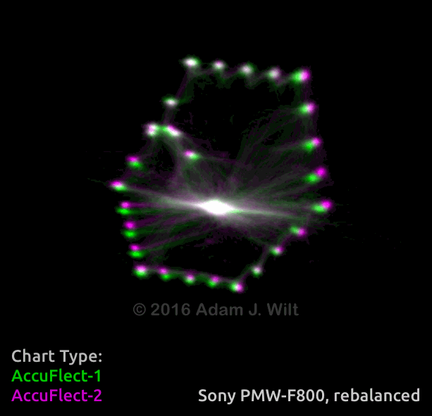
The 3-chip Sony also shows very clean color.
There appears to be a slight white-balance shift between the two charts. I don’t know if I bumped something when switching between charts of if the camera saw a difference between the neutral grays on the two charts. In case of the former, I compensated for the white-balance shift with a slight adjustment, and got:
There’s a red shift in greens and yellows, and a blue shift in magentas and blues.
Single-sensor cameras (on-chip color filter array)
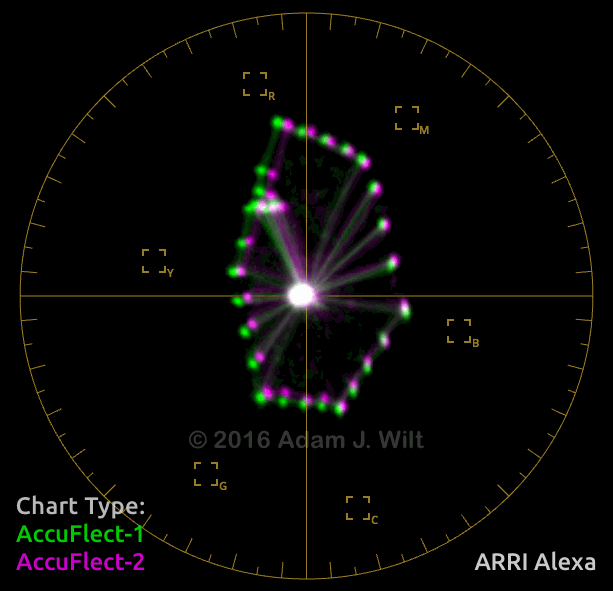
The ARRI Alexa shows a magenta shift in the greens, and a blue shift in the hues on the upper half of the vectorscope.
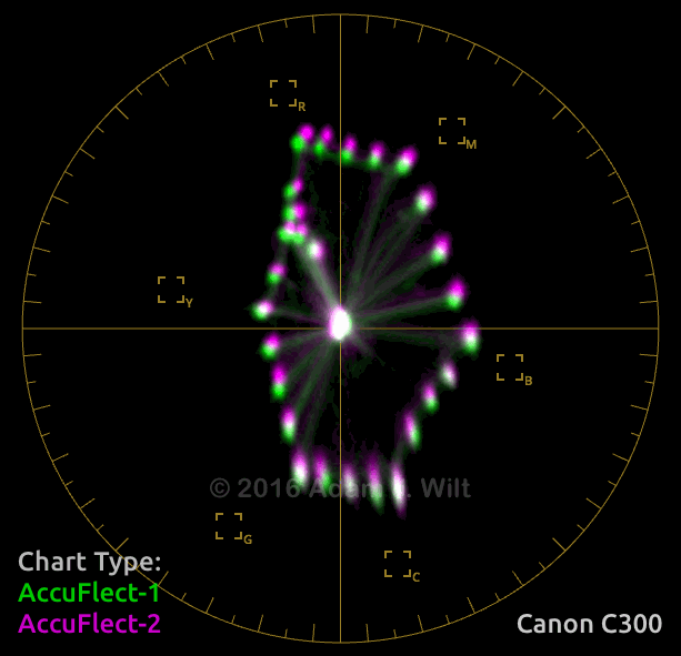
The Canon C300 Mark II shows red and magenta shifts.
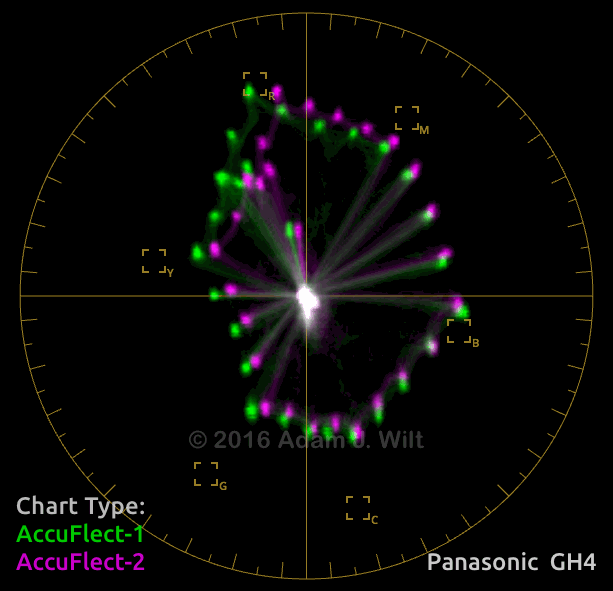
The Panasonic GH4 shows mostly magenta shifts, but greens through reds go blue, while cyans and blues shift red.
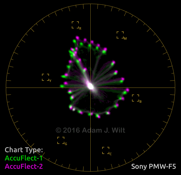
The F5 shows a somewhat moth-eaten hexagon between red and green; from previous experience it looks much like the F55 in that regard. And yet, the Sonys deliver pretty good color—obviously there’s more to color than perfect test-chart rendering. Colors on the AccuFlect-2 shift in various directions.
It’s worth noting that while all the cameras have their own characteristics, they’re all weak (undersaturated) in the greens, and many also fall short in cyans. Generally speaking, most of the cameras’ vectorscope patterns are “top heavy” and can’t be corrected with simple matrix manipulations alone (not unless that camera has bi-modal matrix adjustments like the VariCam LT does). The question of why this occurs is interesting, but that’s a topic for a different day.
You might ask what color space or “look” I used on each camera. Answer: I didn’t check; I assumed that the fundamental color sensitivities of each camera would remain much the same whatever look I chose, and I was more interested in Arri vs. Sony vs. Canon than in Rec.709 vs. SLog vs. Slog3.
You might also ask: why shoot under tungsten if the colors are calculated for a D65 illuminant? Answer: the basic shapes and distributions of the vectorscope hexagons, once each camera is appropriately white-balanced, are largely the same under full-spectrum tungsten as they are under D65 “daylight”—and I have a consistent, repeatable, full-spectrum tungsten light I can carry with me. The sun, especially this time of year? Not so much.
So, what do I make of all this?
The 3-chip cameras render nicely hexagonal patterns, as they should; the 1-chip cameras are sloppier. This is expected, as the color filtration on 3-chip cameras tends towards more saturation and sharper cutoffs between colors.
The two charts, using ostensibly the same colors, render differently on different cameras. The shift in any given color patch varies from camera to camera, and isn’t necessarily correlated with the way other colors on the charts shift on that same camera.
While the two charts may yield “identical” colors on a spectrometer in terms of their CIE x,y coordinates, there are subtle differences in the spectral power distributions of a given color on the two charts. Those differences, which may cancel out in the spectrometer’s calculations, are subtle but not invisible on-camera. Why? Different cameras use different color filters, and the slight differences and idiosyncrasies in the spectral sensitivities of the cameras leads to the differing results we see in the comparisons above.
If the SPDs of the pigments on the DSC Charts are like those of the X-Rite ColorChecker chart,
(or see this), the different colors on the charts are not consistently narrowband, highly selective reflectors, any more than the three color filters in a camera precisely separate colors:
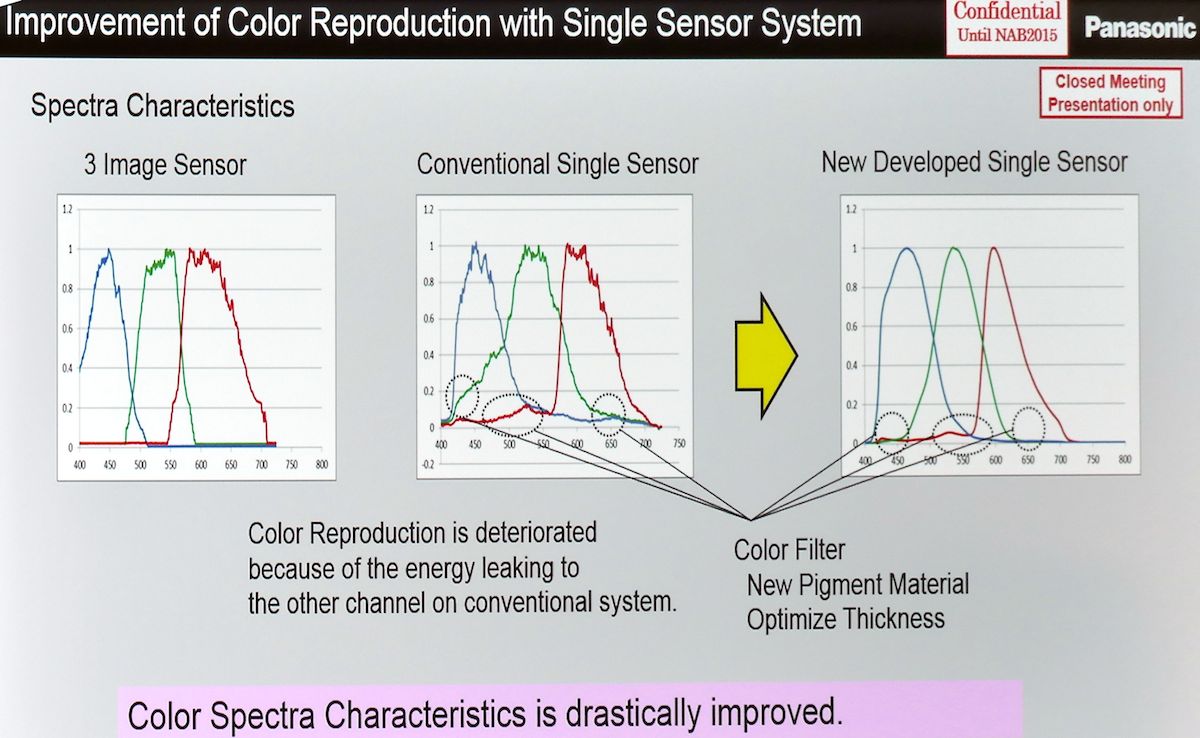
Minor differences in spectral power distribution for a chart color anywhere in the overlap region of a camera’s color filters can have a dramatic effect in the color that camera renders, and as the “bandwidths” of the various color patches differ, some may be inherently more prone to showing differences between cameras than others.
Some cameras, like the HDX900 and F800, see very little difference between the charts, while others like the PMW-F5 and DMC-GH4 observe a more dramatic difference. As the 900 and 800 use highly selective dichroic prism filters with sharp, well-defined cutoffs, it’s perhaps not surprising that (a) they render fairly clean hexagons on the vectorscope and (b) each one sees the two charts very similarly. The 1-chip cameras, by contrast, have “sloppier”, wider color-separation filters and as a result they are more subject to any variation in spectral power distributions between two versions of the “same” color on two different charts.
What IS Correct Color?
This leaves us with a quandary: we have two charts, both claiming to carry accurate patches of half-saturation color, yet they look different on-camera. Which one is correct? Is either one correct?
“Two men say they’re Jesus
one of them must be wrong”— Dire Straits, “Industrial Disease”
Let’s assume that DSC Labs has done their job properly and with high standards. In that case, it’s safe to assume that both their charts are indeed correct… as measured on their pricey precision spectroradiometer. That is, if I rented the same spectroradiometer DSC is using and viewed their charts under the same illumination, I should get the same x,y values for the “same” colors on both charts.
But that doesn’t mean that a different spectroradiometer, using its own sensor, a different color separator (a diffraction grating vs. a linear variable filter, perhaps), and its own color math will show the same results. And as we’ve seen above, different cameras will definitely render the differences between the charts differently.
Since different cameras have their own individual spectral sensitivities, matrixing, and color science, they see the world differently (that won’t come as any surprise to anyone who has tried to precisely match dissimilar cameras, like a Sony and a Panasonic, on a multicam shoot). So it shouldn’t be a surprise that different cameras not only see the charts differently, but see differences between the charts differently, too.
As to which one is correct, one might as well ask, “does a dog have a Buddha-nature or not?” What this test tells us is that color charts are as variable on-camera as any other colors in the real world; a physical patch of color reflect a grab-bag of wavelengths across the visible spectrum and beyond that a camera simplifies down to a simple R,G,B, triad in its own idiosyncratic way. Does that mean that the camera set up to one chart is more “correct” than when it’s set up to the other chart? Or is it the other way around?
Putting AccuFlect-2 to the test
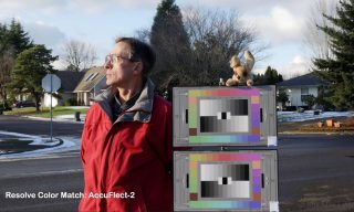
I popped outside with the two charts and shot a test image, using the GH4 on its “Std” setting at default tint and saturation:
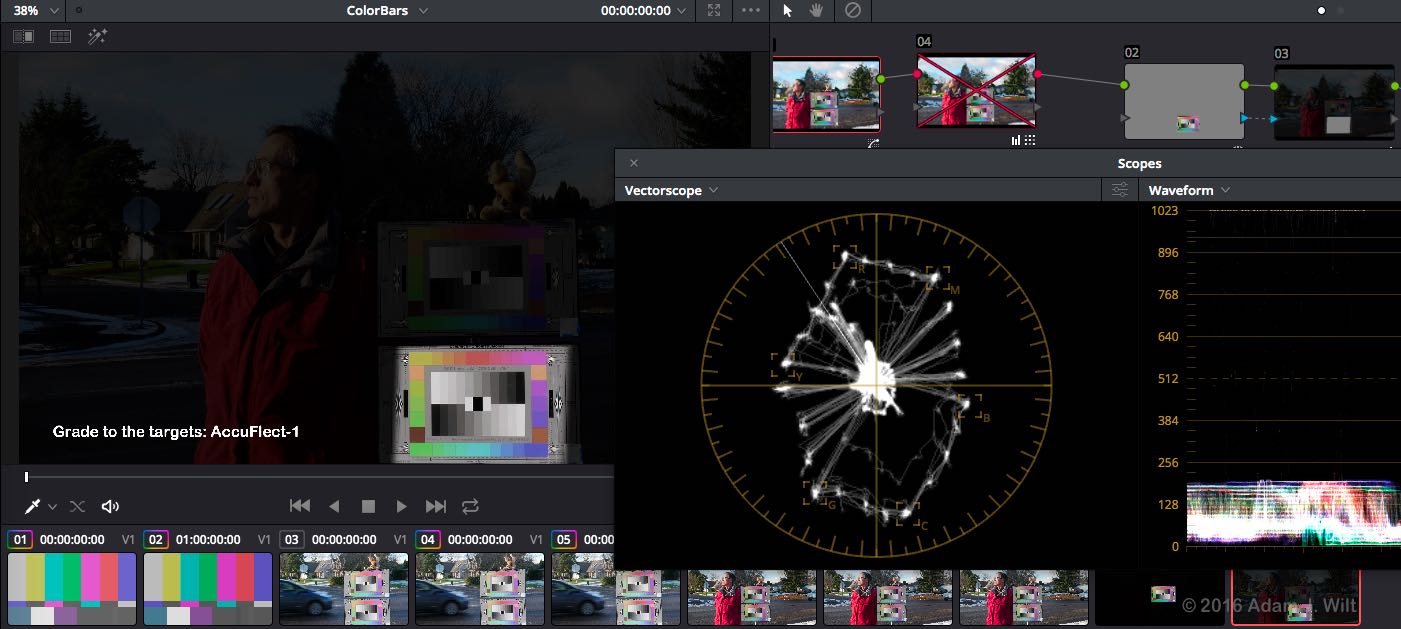
I used DaVinci Resolve’s Color Match function to auto-grade the image to each of the two charts using the built-in ChromaDuMonde data in Resolve:
Both of these auto-grades made fairly minor adjustments to the color, but in both cases the fundamental shape of the vectorscope hexagon—lacking in the yellows, greens, and cyans— was unchanged. So I went in and did a full manual correction (after dimming most of the image so I could focus on the chart), pulling each primary and secondary color back into its box and aiming for a clean-ish hexagonal pattern:
I wound up with these:
Which of the four images is “correct”? I’d say that the closest match to what I saw by eye is in between the two manual corrections, but weighted towards the AccuFlect-2 version: that jacket isn’t quite as orange as AccuFlect-2 you leave you to believe, but it’s nowhere near as magenta as the uncorrected and AccuFlect-1 versions would imply. Both the manual grades are truer to life in their more saturated yellows, greens, and cyans. But is any of these images exactly what my eye saw? No. The GH4 has imprinted its own personality on the image, and that can’t be wholly undone.
Now, I’ve been using AccuFlect-1 charts for years. Was that a mistake? Is AccuFlect-2 better?
For what it’s worth, DSC’s founder David Corley says that he sometimes gets complaints that faces are bit on the pinkish/magenta side after setting up a camera to AccuFlect-1 colors; the general magenta shift of the AccuFlect-2 chart (at least as seen by the cameras I tested) will correct that as a shift in the chart, once dialed out either in the camera’s setup or in color-correction, results in a complementary shift in scene colors. Faces photographed and corrected with reference to the AccuFlect-2 chart will be less pink, more yellow/green than they would be when corrected to AccuFlect-1 colors.
So perhaps AccuFlect-2 is “more correct” than AccuFlect-1—at least for those cameras that rendered pinkish skintones using AccuFlect-1.
Does a chart have Buddha-nature?
What it really comes down to is that looking for a “perfectly accurate” color chart—one that invariably renders a half-saturated magenta patch of a certain brightness as RGB=0.75,0.375,0.75 when seen by an arbitrary camera—is a fool’s game. The messy, broad-spectrum nature of physical pigments, concatenated with the idiosyncratic color rendering of any chosen camera, renders the quest Quixotic.
While electronically-generated colorbars can be set and measured with certainty, camera-captured colors in the real world aren’t nearly so compliant. You could, conceivably, make a “correct” chart for one particular camera, but that doesn’t mean it would read correctly on any other camera; it almost certainly wouldn’t. That’s the compromise a chart manufacturer lives with: their “reference camera” is whatever measurement tool they use to align their colors to CIE x,y targets, but real-world cameras may not—indeed, probably won’t—see that chart quite the same way. The AccuFlect-1 magenta may well be the same photometrically as the AccuFlect-2 magenta as measured by the spectroradiometer that DSC Labs uses. But which of the two magentas is “correct” for an Alexa? For a GH4? For an F800? As Jōshū might say, “mu!”
The real value of a color chart is in camera matching and in maintaining consistency of rendering throughout a production, not in precisely replicating colorbar colors. For the most part, the eye isn’t especially bothered if a color in a scene isn’t spot-on, but a sudden change in that color when cutting between cameras can be quite distressing.
A color chart is a portable set of constant color references, regardless of whether they’re “correct” or not: many people happily use an X-Rite ColorChecker Classic as a video color chart despite the fact that its colors aren’t designed to line up anywhere in particular on a vectorscope.

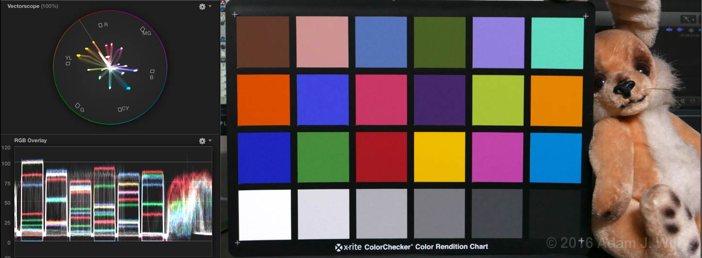
Whether it’s “accurate” or “correct” isn’t as important as whether it adequately covers the range of hues you’ll see in an image and gives you solid color targets you can compare across shots or between cameras.
I don’t mean to give the impression that video-calibrated color charts that hit vectorscope targets aren’t worthwhile. If you’re working in broadcast, it is essential to have a “correct” standard to match your cameras to—even when, as we’ve seen, “correct” can vary slightly—so that feeds from different studios, remotes, and even different networks can be intercut seamlessly. Even if you’re setting up a remote pool feed in Beijing with an AccuFlect-2 chart while the studios in NYC and London use an AccuFlect-1, you’ll still be in close chromatic agreement. A chart where the colors are designed to hit their vectorscope targets lets you work with objective measuring tools—waveform monitors and vectorscopes—so you can set up a camera in Beijing and know that the images will look the same in New York or London.
So stop worrying about which color chart is the right chart (though I do have some opinions). Pick a chart that works for you, stick with it, and you’ll be fine.
Disclosure: I consult for DSC Labs and received their permission to publish this article, but I haven’t been compensated by them for doing so. I have no material relationship to X-Rite, Gamma & Density, Koerner Camera, Blackmagic Design, or any of the camera or spectroradiometer makers mentioned or linked to.
I’ve edited the article with a note about the colors on the G&D cart (I don’t know that they hit saturation targets) and to point out that target-hitting, video-standard charts are essential for broadcast work. And to point out that Filmtools offers better charts for video / cine work than the one in the ad below:
(Filmtools also carries DSC Labs charts as well as the Passport Video.)

Filmtools
Filmmakers go-to destination for pre-production, production & post production equipment!
Shop Now