


Color awareness came slowly to me, but now I can’t escape it. Read on, and follow me down the rabbit hole.
This article started out as an analysis of how different cameras see color, but evolved into something more. First I’m going to talk about color perception and the basics of learning how to see it. Then we’ll touch on how cameras create color at a very basic level, and why it’s amazing that cameras work at all. Lastly, I’ll talk about what color characteristics I’ve noticed in various cameras, and why that’s important to how we work.
LEARNING TO SEE
Years ago I came across a book entitled The Wagner Color Response Report. Back in the 1980s, designer Carlton Wagner conducted extensive experiments to discover how diffferently-colored objects and environments affect human emotions. Among other things, he learned:
- green is a soothing color for transitory spaces such as hotel rooms, although it’s not pleasant over the long term
- blue is calming but makes interiors feel cold
- reds stimulate the adrenal gland and cause one to lose track of time
- yellow requires the most mental processing power, so it keeps people moving through hallways and lobbies
- artists love gray
- people from lower socioeconomic levels respond well to bright primary colors, which is why most fast food restaurant logos use red, yellow and blue
- rich people prefer more subtle hues, especially variants of green
Most interesting to me were the nuances. The ones that stuck with me initially had to do with reds. Men, said Wagner, prefer orangish reds, while women prefer blueish reds. When he traveled by plane he wore a blueish-red tie as he felt he received more attention from the female flight attendants. (I’ve noticed that the huge red genitalia-compensating pickup trucks that tailgate me on the freeway are always an orangish red rather than a blueish red.)
There are very few primary colors in the natural world. Many green plants are actually yellowish green or blueish green. Blue skies are often greenish blue—not quite cyan, but not a pure, rich primary blue either.
I threw these samples together to give you an idea of what I’m talking about:


Top to bottom: orangish red (RGB 255, 50, 0), red (255, 0, 0) and blueish red (255, 0, 50). The orange red stands out a bit more as our eyes are primarily sensitive to green (and derive most of our sense of lightness from green), and secondarily sensitive to red, so the addition of a little green to red makes it appear brighter. We’re least sensitive to blue, so a blueish red appears less vibrant.

Top to bottom: reddish blue (50, 0, 255), blue (0, 0, 255), and greenish blue (0, 50, 255). The addition of green to nearly any hue makes it appear brighter. To my eye, the greenish blue appears more “blue” to me than the primary blue does. The human eye’s response to the cyan portion of the spectrum (which falls between blue and green) is very low, so cyan hues may appear unusually pleasing simply because we don’t see them very well, and it’s a treat when we do. Many cameras add a little green to their blues to make them pop and create what I call ”eye candy” blues.

Top to bottom: blueish green (0, 255, 100), green (0, 255, 0) and reddish green (100, 255, 0). I had to increase the amount of red and blue added from 50 (above) to 100, as 50 resulted in very little change in hue on my monitor (which is theoretically calibrated and fairly good at color rendition). Green is such a large component of our sense of lightness that one has to add a lot more red or blue to achieve the same perceptual level of hue shift as we saw when adding green to red or blue.
According to The Wagner Color Response Report, yellow—a mixture of the two hues to which the human eye is most sensitive, red and green—uses the most visual processing power in the brain, and because of this yellow is very good at grabbing attention.
This may be why most traffic alert signs in the U.S. are yellowish green: the green helps us see the signs from a great distance, while yellow grabs our attention and holds it.


An example of a yellow-green U.S. road safety sign. The Wagner Color Response Report says that black and yellow is an innate warning of danger (see “bees” and “wasps”). Not only does the greenish yellow hue of this sign grab out attention, but the contrast of yellow and black has deeper psychological undertones.
HOW CAMERAS SEE COLOR THROUGH MATH
The reason I’m pointing out these subtleties is because the best cameras see these slight differences in hues, whereas the worst ones don’t. Some of this has to do with color spaces: Rec 709, for example, is adequate but doesn’t come anywhere near rendering the full range of greens that the average human eye can see, whereas P3 (and Rec 2020, which is not yet viewable on any device) shows an immense range of saturated and subtle hues of green, especially in highlights.


This shows the spectral response curve of the Sony F65, which encompasses Rec 2020. Note how small the Rec 709 gamut is by comparison, and also note that while blue gets a little boost in saturation between gamuts, and red gets a larger boost, green saturation increases the most. The broader the color space, the more saturated the hues within it.
Much of this, though, has to do with how well a camera’s sensor can discern between hues in the first place. This is the result of a complex interplay of physical design and math.


A good example of this is the difference between S-Gamut3 and S-Gamut3.cine. Some colorists resist grading through LUTs and prefer to use lift/gamma/gain controls only. S-Gamut3 makes that difficult, as the green primary is shifted in relation to Rec 709 and P3. Reducing green saturation from SGamut3 to a smaller color space will result in odd color shifts as SGamut3’s green primary color doesn’t line up with Rec 709’s green primary.
S-Gamut3.cine’s gamut is slightly reduced but the green primary is rotated to line up with Rec 709 and P3, so greens reproduce accurately when the color gamut shrinks, as the green primaries of all three color spaces fall along a line that extends all the way to white. Amazingly, this is done entirely with math.
Sony’s original wide gamut color space, SGamut, had a number of color distortion issues that were fixed in SGamut3. Both have the same color gamut, but different math that governs how hues are rendered.
A spectral response map of how the various cones in the average human eye see color shows that the ranges of “green” light and “red” light overlap quite a lot, as illustrated in this diagram:


The cones in the eye are labeled “short,” “medium” and “long,” but they correspond roughly to blue, green and red.
Our eyes see a lot of hues between red and green, and this diagram shows us why: the red and green cones in our retinas overlap considerably. Green contributes roughly 70% to our sense of brightness, and red contributes another 20% or so. Those two ranges combined constitute 90% of our sense of how light or dark things are.


The reduced overlap between green and blue results in fewer hues between them. On the warm side we have red, reddish orange, orange, orange yellow, yellow, greenish yellow, yellow green, yellowish green and green. On the cool side we have blue, greenish blue, blueish green and green.


The visible spectrum. Blue, green and red are roughly defined as falling at 450nm, 550nm and 650nm. Fun fact: the line of purples in the CIE chart above are often referred to as “extra spectral” colors as they aren’t defined as having a specific wavelength of light but are instead combinations of red and blue… but the one exception to that is violet: at the very bottom of human vision our red cones become sensitive to blue light again, and we do perceive light between 380nm and 450nm as a purplish blue.
Blue hangs out largely on its own. There’s much less crossover between itself and green, and very little crossover between blue and red. Blue and green combine to create a comparatively limited range of blueish greens or greenish blues, whereas red and green combine to create a broad range of warm greens, yellows, oranges, reddish oranges… and flesh tone.
Cameras try to mimic the human eye’s response to color with filters that pass the right wavelengths and cross over each other in much the same way that the eye’s cones do. Sadly, this is next to impossible to achieve. Single sensor camera colorimetry is limited by the kinds of red, green and blue dyes and pigments available that will do the job, the kinds of materials that will adhere to the surface of the sensor, and how much spectral overlap exists between each hue. That’s the important bit: no dye or pigment is completely pure, and there will always be a bit of crossover between red, green and blue.
That’s where the color correction matrix comes in. This is a brute force math process that is imposed very early in the color creation chain. The matrix adds and subtracts (mostly subtracts) hues from each other to make them more pure. It doesn’t subtract the actual colors from each other; rather, it subtracts each color’s SIGNAL from the others. To some extent, it uses math to purify them.
Silicon can only detect light. It can’t detect color. The camera’s processor can sort out colors because it knows what kind of filter sits on top of each photo site. None of these filters are completely pure, though. The filter over the blue photo sites, for example, will always pass a little red and green as well, and the camera’s processor will interpret that light as blue. The color correction matrix is designed to subtract this contamination mathematically, which improves the camera’s ability to reproduce pure hues. For example, to reproduce a pure blue, the matrix will subtract some of the red and blue signals from the blue signal to remove their influence and make pure blues appear more saturated.
The matrix does this for each color channel, and it’s a mathematical balancing act: the signals must be added to and subtracted from each other in order to create the purest primary colors possible, as this increases the range of colors the camera can reproduce and also expands its color gamut, but subtracting too much of one signal from another increases noise. Every color channel has noise in it: if we subtract a lot of the blue channel’s signal from red, for example, the noise in the blue signal leaves “holes” in red’s signal… and that looks like noise.
That’s how camera color reproduction works at its most basic level: red, green and blue light is passed to the sensor, and their resulting signals are mixed or unmixed until they represent real world colors accurately, or in some cases, prettily. It’s a juggling act between the purity of the red, green and blue filters and the math that pushes their signals around. The trick is that the spectrum of light passed by each red, green or blue filter must overlap each other enough that secondary colors can be reproduced (for example, red and green intersect to create flesh tone) without overlapping so much that it’s nearly impossible to detect a pure hue, which results in severely desaturated color.
Large color gamuts are defined by very pure primary colors, so it stands to reason that the filters on the sensor’s photo sites must be richer. I’m told this is the reason why the Sony F5 and F55 differ in sensitivity: the photo sites are the same size, so they collect the same number of photons over the same amount of time, but the filters on the F55’s photo sites are more saturated in hue. This reduces the amount of light passed to the sensor, which lowers the camera’s ISO, but it helps the camera’s processor create pure hues without introducing much noise, and that increases the camera’s color gamut.
WHAT GIVES A CAMERA ITS “LOOK”
While watching an early demo of a recently introduced new-but-low-cost camera I saw a shot of two men sitting in a cafe, enjoying their morning coffee. This was a dynamic range demonstration, so the camera was inside the dark cafe shooting out onto a sunlit street. The camera captured all the shadow and highlight detail, which was impressive, but I noticed something strange: there were two red cars parked across the street—different models from different manufacturers—and they were the exact same hue of red.
That. Never. Happens.
As the video continued, I saw that flesh tones were a bright orange in hue and showed very little variation. There were no subtle hints of red or yellow or blue, as one sees in real skin; everyone looked like a cross between a human and a Cheeto.
I saw some stunning sunset aerial footage, with the sun breaking through clouds at sunset and raking across a city, but there wasn’t much variation in the hue of the sunlight. It was mostly yellowish red, with some reddish yellow mixed in. It was pretty, but there weren’t a lot of subtle hues.
There’s quite a lot of footage from this camera on Vimeo, so I looked through a bit of it and paid attention to how it reproduced subtleties of color. One video, of a wedding, showed every red item of clothing in the wedding party to be exactly the same hue. Blues were mostly the same blue. Skin tones looked to be exactly the same hue, varying only in brightness.
I saw a number of stunning shots, but I realized that they were stunning due to texture, not hue. One shot, of a person walking along railroad tracks, was interesting because the textured gravel bed on which the train tracks lay was broken up by bits of color from fallen leaves… but the leaves were the exact same hue as the tall waving grass in the background. A short film shot in a forest showed the trees as either yellow brown or brownish yellow, but nothing else. There was no subtlety between those hues.
This camera is the latest in a line, and it boasts increased dynamic range over its predecessors. “How,” I wondered, “could they increase dynamic range but end up with such one-note color?” The only solution I could think of is that the filters on the photo sites must be less pure, with lots of overlap, so each photo site captures lots of light at low light levels but at the expense of subtle color. The color matrix, and whatever LUTs may be applied thereafter, can only render about eight solid hues (red, orange, yellow, flesh tone, green, cyan, blue, purple) but not much in between.
Those in-between colors are where the magic lies.
I’ve learned to pay a lot of attention to how cameras render color. Here’s some of what I’ve seen.
RED
When the Panasonic SDX900 and original Varicams appeared, they made a huge splash due to their sophisticated color response. Sony cameras tended to render purples and cyans as one hue of blue, while Panasonic cameras largely rendered them true to life. Sony cameras reproduced reds as orange reds, while Panasonic cameras rendered a fairly pure red that were just very slightly orange. (“Candy apple red” was the only hue that Panasonic couldn’t reproduce accurately at that time.)
Sony reds are a lot better now, although they still pull a little toward the yellow (orange) side. Alexa reds seem slightly cool. Canon reds are orange, end of story. There’s one matrix setting in the C300 (EOS standard) that renders reds normally, but the default setting is to push reds noticeably toward yellow. As best I can tell, this blends facial blemishes (which are generally red) into flesh tone and helps to hide them. As Canons are known for their beautiful flesh tone, it seems that this is a case where pretty color trumps accurate color, at least for those who like the “Canon look.”
Another aspect of the Canon look is that greens have a lot of blue in them: anyone who has shot green screen with a Canon camera knows that the default result is a cyan screen. I had no idea why this was desirable until I shot a commercial with a lot of people running around in a grassy field. The EOS standard matrix made green the proper hue, but that green was so intense that it drew my eye away from the people. I tried another matrix that made the grass cyan, which toned it down and created a nice contrast with warm flesh tone. Rather than upstaging the actors, the muted grass color caused the skin tones of the actors to “pop,” making them more visible.
Making a proper red is tricky, and seems to have a lot to do with where the sensor’s IR cut filter kicks in. The blue dye used on most sensors has a leak in the IR portion of the spectrum, so if the IR cut isn’t low enough the blue photo sites will start seeing blue in everything that’s red. That appears to have been the issue in the early RED cameras: the IR cut was so high that there was a lot of blue and red crossover, especially under tungsten light, such that it was almost impossible to make either hue pure. This resulted in overexposed reds and generally desaturated color, as hues that cross over by too much can never be made truly pure. The benefit was that the camera was a lot more sensitive under tungsten light because the blue channel, which is typically the noisiest, got “flashed” by abundant amounts of red light, which boosted its exposure and reduced noise.
The new Dragon skin tone IR filter (improperly called the “skin tone OLPF”—the optical low pass filter affects resolution and moire, and the IR cut is often part of that filter package but has no affect on resolution) fixes that issue as it cuts low enough that blue doesn’t react to red light anymore, so red and blue can be made to appear more pure. The camera is slower, but the color is significantly richer and more subtle.
The low light IR filter seems to be the original RED IR cut filter under a new name. If you put the low light filter in the camera but set the in-camera matrix to skin tone, the image will turn bright red as the skin tone matrix doesn’t remove all the red light that the low light filter lets through to flash the blue photo sites.
YELLOW
When the Sony F5 and F55 first came out a friend of mine told me never to use either one to shoot sunsets. “Yellow is OFF THE CHARTS,” he said. He was right: yellow hues leapt off the vectorscope and were crazily oversaturated. It seemed that the combination of red and green—the two hues to which our eyes are most sensitive—wasn’t appropriately reigned in.
This was an issue with SGamut, Sony’s original expanded gamut color science. SGamut3/SGamut3.cine pulled yellow back and restored its lost subtlety. Where an SGamut sunset was YELLOW, an SGamut3.cine sunset contained delicate hues of light orange and salmon. (I created this video to demonstrate the differences between these two color gamuts.)
Nothing physically changed in the camera. The new look was strictly due to tweaks in math. That amazes me. So much of the look of a camera has to do with someone’s subjective opinion of what looks good, in combination with the math skill necessary to create that look from the signals provided. It’s insanely complex stuff bordering on witchcraft. In fact, I wish it was witchcraft, as that’s much more accessible to me than the math equations I see in books on color science. Calculus is hard, but anyone can sacrifice a chicken.
The Panasonic Varicam is very good at reproducing yellow, which has a tendency in most cameras to tip over into green. Yellow skin tones are pleasant, but green skin tones look ill. It’s a very delicate balance. I’ll often add a whisper of minus green (magenta) gel when I’m using straw or yellow gels to pull them back from the ledge that tips into green.
GREEN
Green is the most powerful of colors. In any expanded color gamut, green is the hue that sees the most benefit. When comparing Rec 709 to P3 or Rec 2020, red and blue get a little bit of a saturation boost but green positively soars.
Let’s revisit two charts:


Red and green intersect a lot, whereas green and blue intersect a lot less. It’s possible to mix many more subtle hues with green and red than green and blue, and that first diagram seems to show us why.
Green is probably the hardest hue to properly manage in a camera. Red and blue primarily overlap with green, and not so much with each other, as they are on opposite ends of the spectrum. Green, though, overlaps both. Pure reds and blues can be easily had by subtracting green from their signals, but a pure green requires subtracting both red and blue signals from green.
Every time we subtract a color channel from another, we add noise. There’s only so far you can push these things in math before one has to make a choice between saturation and noise. Reproducing a pure green means subtracting a lot of red and blue from the green signal, because they both overlap green a lot. Green gets hit twice as hard as they do.
This image from DXOMark, showing the Dragon sensor’s spectral response curves, illustrates this point well. (This is the page on which that image resides.)
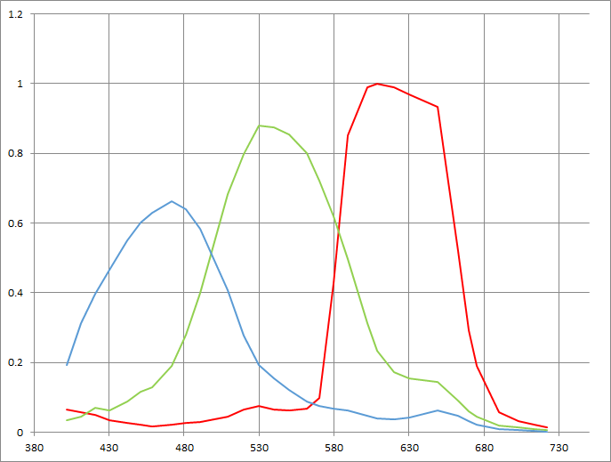
I’ve noticed that a lot of lower-end cameras have difficulties with dark greens. For a long time I called this the “metallic look” as I couldn’t quite quantify it, but I recently figured out what was going on after going over some low saturation footage with an RGB color picker.
A lot of tree leaves are a cool blueish green, which makes them appear a bit desaturated. Good cameras can still separate green from blue enough, even in dark leaves or in shade, so that the leaves appear to have some color. Poor cameras can’t do that—possibly because their filters overlap so much they can’t separate green from blue at low light levels—and these same leaves turn a weird metallic gray, and basically become black-and-white. This is visible in the real world—redwood leaves in the shade appear almost devoid of color—and the lesser cameras fail to reproduce much color at all in this situation.
I’ve seen this in RED cameras and Blackmagic cameras, and to some extent in the new (and unfinished) Panavision 8K camera that uses a RED sensor.
As we move forward into the strange new world of HDR and wide color gamut television, we’re going to have to pay close attention to how our cameras render green. Some cameras can push green saturation to the limits of a display’s color gamut, and some can’t—and if your project requires rich, lucious greens and yellows and they don’t turn out properly on an HDR display, you may be working with the wrong camera.
BLUE
Blue seems to be the one color that is almost always accurate. I never see cameras that push primary blue toward magenta or cyan. I see cameras that push greens toward blue and render them as cooler greens, but blue is almost always dead on.
Blue is the noisiest channel under tungsten light because it requires what is effectively a one stop “push” before it’s strong enough to white balance with green and red. Silicon is most sensitive to long wavelengths of light, as they penetrate deeper into silicon and generate a stronger voltage, so most sensors are “daylight balanced” because, under daylight, there’s tons of blue light, so those photo sites get plenty of exposure. There’s almost no blue in tungsten light, so the blue signal needs a lot of help—and that translates into noise.
It’s not unusual for cool hues to pop under daylight and warm hues to pop under tungsten. It all goes back to how much work the color matrix can do to create pure hues: making blue more saturated under tungsten light makes a noisy channel noisier, so it’s best not to push it too far. Under daylight, though, the noise is much less so it can be more fully saturated.
Arri has a wonderful presentation on this here.
CYAN
The weird thing about cyan is that we’re not very sensitive to it, so we love it when we see it. Once again, let’s look at this graph:

Green and blue don’t overlap much at all. I’ve seen this when testing cameras: when aimed up at a color chart, the cyan vector is almost always the least saturated on the vectorscope. Even when I can make all the other hues hit the boxes, cyan falls short. It appears that many cameras emulate what our eyes see almost to a fault.
When I see cyan it’s like candy to my eyes. The Panasonic Varicam creates marvelously subtle and rich cyans, and some of their demos are dazzling specifically because their cyans are so striking. Maybe cyan really is like candy: we never seen saturated cyans in nature, so when we do see them they look particularly beautiful.
I like cyans as an effect, but not as a feature. SGamut rendered skies as cyan, and I hated that look because it felt unreal. In that context, cyan was a “broadcast” color and not a “film” color. (Broadcast TV—game shows, sports, news, talk shows, reality shows—tend to be big, bright and saturated. Films tend to be less saturated, with more subtle secondary and tertiary hues.) I was ecstatic when SGamut3.cine came out and gave back my subtle pastel blue skies.
MAGENTA
This is a weird color. I don’t pay much attention to it because I don’t see it much, at least not in any normal context. It’s technically an “extra spectral” color in that there is no magenta or purple hue in the visible light spectrum. It’s always a mix of blue and red, or—much more often—an absence of green. That’s how the green/magenta control on LED lights works: turning the control toward magenta (or minus green) simply dims the green LED in relation to red and blue.
Violet is an exception. Toward the very bottom of the visual spectrum the red cones in our eyes become slightly sensitive to blue light. If you’ve ever looked at an ultraviolet LED and wondered why it looked purple instead of pure blue, that’s why.
Magenta is an insidious color in the modern world. Many modern light sources, such as fluorescents and LEDs, exhibit green spikes that are hard to remove. Low-E glass in office buildings and cars shaves off the UV and IR spectrum to reduce heat and wear on interior objects, and the resulting light is green. Green gels don’t precisely compensate for any of these situations, so often we’re stuck with a choice between images that are slightly magenta or slightly green. Green flesh tone makes people look ill, but magenta skin emphasizes blemishes and makes them appear to have a skin disease. Sometimes too much green makes an image appear yellow, which is often the better of two marginal choices.
SKIN TONE
Arri Alexa produces skin tones that are both saturated but bright at the same time, while not being brightly saturated. Imagine a richly saturated dark image, and then turn up the brightness without turning up the saturation. That’s part of Arri’s magic: once a hue passes middle gray in brightness it becomes brighter, but it does not become more saturated. (Film does this too. I suspect that’s not a coincidence.)
Canon and Panasonic cameras tend toward rendering skin tones warmer than they normally are. As I mentioned above, Canon reds skew towards orange, so they are compressing a lot of the warm hues in flesh tone into a very narrow range to eliminate imperfections and make people glow. Panasonic tends to be a little more subtle in this regard, so while their flesh tones are naturally richer they also show more subtlety of hue. Actual skin has hints of pink, red and blue, and that subtlety is what makes people look alive. Low-end cameras render flesh tone as one color, compressing all those subtleties into a narrow range so skin appears one hue (say, light orange). Old REDs were very good at doing this under tungsten light, although Dragons with skin tone IR filters do a vastly better job.
The flesh tones I get from Sony F5 and F55 cameras in custom mode (where I have full matrix, gamma and all the usual video engineering controls) look garish to me. It’s the “broadcast” look that sells TVs to consumers who appreciate bright colors and lots of contrast. I prefer Cine-EI mode and the built-in LUTs (in particular, LC709typeA) which are much gentler and less saturated. LC709typeA actually tries to emulate Alexa color, as many cinematographers wanted to work with Sony cameras but disliked the “broadcast look.” It doesn’t match an Alexa—clearly there’s more than just math to creating Arri’s look—but I think it looks better to “film eyes” than Sony cameras have in the past. I especially like the F55 as it is capable of very pure hues and great subtlety.
This shows the power of color math, as both the broadcast and Cine-EI “looks” are derived from the same sensor data.
IS THIS REALLY IMPORTANT STUFF?
If you’re serious about cinematography, sure. Our work sells to consumers, but we shoot for ourselves, and the sophistication in our work is appreciated by consumers at an emotional level. It’s almost never recognized consciously, but we’re not in the business of pointing out how great our imaging techniques are. We move people through visual imagery, and the broader our palette the more subtle the emotions that we can paint.
For most work, the choice of camera doesn’t matter a lot. Sometimes, though, it can make all the difference. If I were to shoot a fashion job I might choose the Panasonic Varicam, as it reproduces the many very subtle hues that one finds in designer fabrics, although the Arri Alexa would be a good choice as well. Alexa skin tone is second to none, although Panasonic comes in a close second in my book. The Sony F55 reproduces pure hues very nicely, where F5 colors are a tad duller and sometimes drift a little towards magenta. Canon makes everyone’s skin look good, but also tends to make everyone look the same… but sometimes that’s perfectly appropriate. Canon is great for pretty color, but not so good for accurate color.
Older Blackmagic cameras look pretty good but are noisy. Newer Blackmagic cameras have less noise but appear to discriminate less between hues. REDs have come a long way, and while the don’t reproduce color with the subtlety of a Varicam or Alexa they do a much better job than they used to.
These are only a few of the considerations that go into choosing a camera, and we haven’t even gotten into lenses yet. Lenses have color too, and sometimes those hues work with, or against, the camera you’ve chosen. That, though, is the subject of a future and very long article.
My suggestion to you is to do as I’ve done: pay attention to color in the real world and try to recognize how much variety surrounds you. If you see something that strikes you as red, ask yourself if it is an orangish red or blueish red. Do the same with green (yellow green or blueish green?) and blue (cool green or cyan?). Note when tree leaves appear golden, or muted green, or monochrome. Pay attention to the color of white light: as I type this the sun is setting outside my window, and somewhere in the distance forest fires are raging, and the light raking across my desk is a mixture of pale salmon and gold.
Reproducing color beautifully—or, better yet, appropriately—requires knowledge in a lot of areas. In days of old we had to know our film stocks: Kodak was generally warm, Fuji was generally cool or neutral, Agfa was more pastel and muted. Now every camera is a film stock, and in some cases they are multiple film stocks. Yes, a lot can be “fixed” in a color grade or a LUT, but artists tend to like to get the bones of an image right before it drifts away into post. It’s also possible to find yourself fighting to create a look in a camera that naturally resists the effect you’re trying to create.
Recognizing how your tools see color, and choosing the right one for the job, will make your life a lot easier while preserving your intent through post.
There are those who say all video cameras look the same. Don’t believe them. They are blind. The differences are there if you look for them, and once you find them you can never unseen them.