

Filmtools
Filmmakers go-to destination for pre-production, production & post production equipment!
Shop Now**TL;DR** When a keyed subject doesn’t sit right in its background, it’s the exposure (and color) that’s the “key” problem. Put up the waveform and match the subject’s black point, white point and gamma to the background’s. Color is the last step and your eye can handle it.

Welcome to Tool Tip Tuesday for Adobe Premiere on ProVideo Coalition.
Between green screen, chroma keying and the new object masking, I’m in love with how fast I can take person A and put them into shot B.
What I don’t see much attention paid to is why so many of those composites don’t look good. It’s a color issue. It’s all about Luma and Chroma.
In this case the exposure and color cast of your foreground element doesn’t match the background.
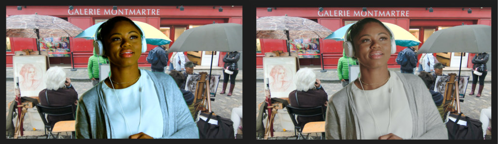
The solution? Make it match.
Luma first: Look at the waveform
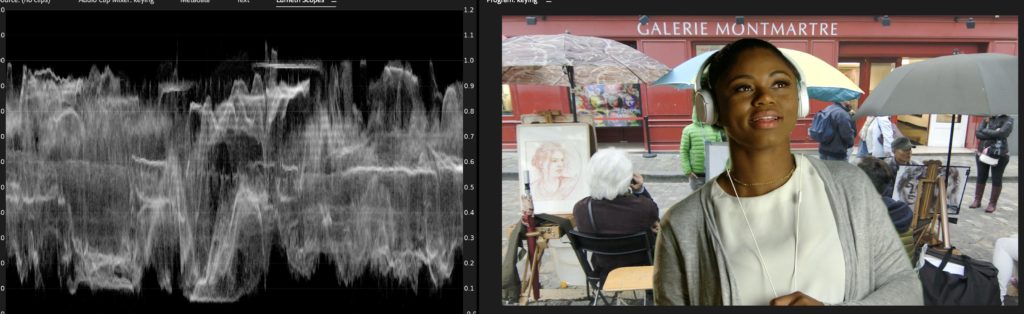
Here’s a keyed subject (I used the object mask tool) dropped over a background.
It doesn’t look right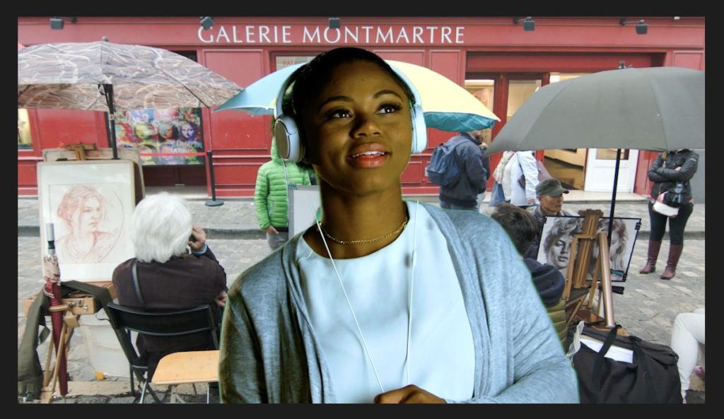 .
.
But why doesn’t it look right?
Start with the exposure.
Bring up the Luma only waveform in Lumetri Scopes.
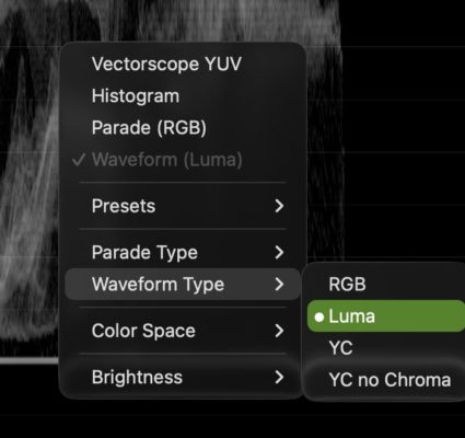
The waveform is a graph of brightness (luma): left to right is position across your frame, bottom to top is dark to bright.
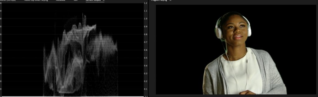
The masked shot: the brightest item is her headphone on the right side and the darkest item is the shadows in her jacket, along with her hairline and her hair.
Now, let’s turn on the background
Look at the bottom (darkest) and top (brightest) of both elements. Turn them on/off in the timeline and watch the waveform. The subject’s darkest and brightest points are different than the background.That mismatch is what your eye is reacting to.
She has way too much contrast to look believable in the composite.
Match three points, in order
You can do this with a luma curve in Lumetri or with the three wheels. It has to be after the key or mask. If you do this before a key, it’ll mess up the keyer. I’ll use curves today.
-
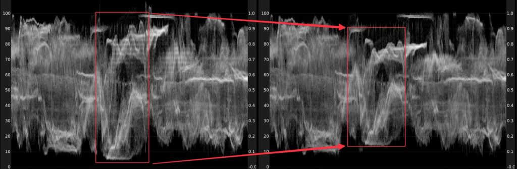
Bring the subject’s brightest point to meet the background’s.
-
Bring the darkest point to meet the background’s.
-
Then the midpoint. Gamma is where exposure really lives. Notice below it’s not at the half way point. It started there and then I moved to lift the darker points and more upwards.
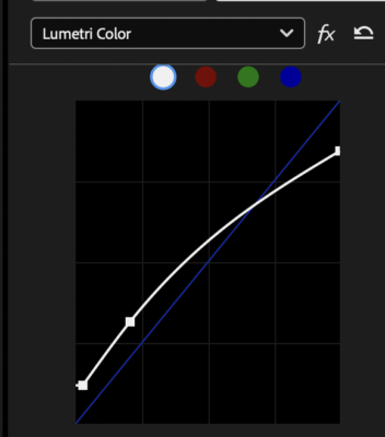
All we’re doing here is adjusting the contrast to match.
The result on the waveform
Then the color
Anything left is color, and it’s generally in the mid-tones. Eyeball it.
Once the brightness matches, a cast is easy to see and easy to dial out, and it’s a much smaller move than you’d think. If the color cast matches but looks more/less colorful? That’s saturation
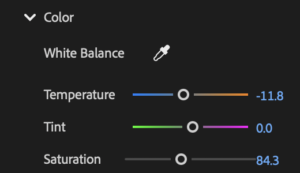
Black point, white point, gamma, then color. That’s what sells the key.
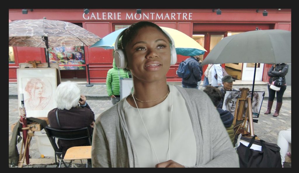
Final thoughts
None of this is a Premiere specific technique. It’s how compositing works, and it will do the same job in After Effects or any other tool you open.
The only thing left that I have to rely on third party tools (or do this in Adobe After Effects, is a concept known as light wrap where the brightness of the background elements bleed into the foreground.
Even without that, this technique will make your masking/keying/composites look like they belong.