https://www.youtube.com/watch?v=VYpPruMgRtU&feature=push-u-sub&attr_tag=RUo26tie784AbxA2-6
This week on MacBreak Studio, I show Steve Martin from Ripple Training how to use the extensive new color correction features in Final Cut Pro 10.4 to achieve the popular “orange and teal” look. To get there, we employ each of the new color correction types including Wheels, Curves, and Hue/Sat Curves.
The look we are going for is based on the idea of increasing color contrast: as opposed to luminance contrast, or dynamic range, which defines the spread of light and dark values across an image, color contrast defines the spread of color values in an image based on the RGB color model as viewed on a vectorscope.
To make a human subject stand out in a scene, in addition to the on-set techniques of framing and focus, we can accentuate the differences not just in brightness between the subject and the background, but also the color differences. Since all skin tones lie along a specific angle of the vector scope at about eleven o’clock (in the reds/oranges), if we push the background to the complementary color, 180 degrees away from the skin tone line in the blue/cyans, we will increase color contrast and therefor make our subject stand out even more.
Therefore our goal in this process is to push colors onto this axis of the vectorscope and to stretch them apart from each other along the axis.
To get there, I start with a Wheels correction to expand the dynamic range of the shot. A few keyboard shortcuts makes it easy to apply this correction and to toggle it off and on while working on it.
From there, I add a Color Curves correction (via a customized keyboard shortcut), and use the Red curve to pull red out of the shadows (thereby increasing cyan) and add red into the highlights (thereby pumping up the skin tones in this luma range). Toggling this correction off and on lets us see in the vectorscope how the traces have expanded along the skin tone line in opposite directions.
At this point the colors are just slightly off the skin tone line, so back in the Color Wheels correction, I use the Tint slider at the bottom to push back onto it.
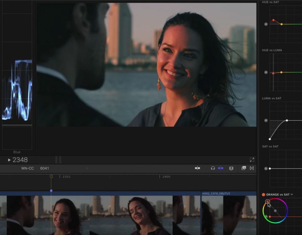
Now to take the look further, I then add a Hue/Saturation Curves correction. There are 6 different curves in this correction: 3 for hue and 3 for saturation. These curves are incredibly powerful for making highly targeted secondary color corrections. I start by using the Hue vs. Hue curve to make the water look a little more realistic by pushing its hue more towards blue. Next I use the Hue vs. Sat curve to increase the saturation of just the skin tones in our main subject. And because the water is a completely different hue, I can use this same curve to adjust the saturation of the water, now that I’ve already dialed in its hue.
Next I use the Hue vs. Luma curve to bring down the brightness of the skin tones just a bit. Some of these adjustments have introduced some color into the deep shadows, so I next use the Luma vs. Sat curve to desaturate just those dark shadow areas.
Finally, I move to the Orange vs. Sat curve. While you can select any hue to adjust, the default orange is along the skin tone line, so it allows you to adjust the saturation of skin tones at specific brightness levels – for example, raising the saturation of the midtones down in the shadows – all just for the skin tone hue.
Check it all out in the video above. If you want to master the new color features of Final Cut Pro X, check out our brand new advanced color correction tutorial.

