This past spring we brought powerful new color workflows into Adobe Premiere Pro with the Lumetri Color panel, and extended your desktop workflow with Adobe Hue, a new type of mobile app that allows you to translate color and light information from a real-life scene into a Look.
This past spring we brought powerful new color workflows into Adobe Premiere Pro with the Lumetri Color panel, and extended your desktop workflow with Adobe Hue, a new type of mobile app that allows you to translate color and light information from a real-life scene into a Look. We are pleased to announce that this control panel will be coming to Adobe After Effects, allowing you to bring your color-graded footage into After Effects with complete fidelity, with the ability to continue to tweak the color until you have exactly the look you want.
The Lumetri Color panel combines Speedgrade technologies with Lightroom-style controls, bringing color correction and grading directly into your editorial workflow. Here, we’ll take a closer look (pun intended) at the Lumetri panel to show how you can build a Look, starting with a real-life inspiration, all the way through professional color grading in Premiere Pro, and seamlessly continue your work in After Effects.
Here’s the clip from a travel show that we’re going to work with:


It’s a nice shot with great dynamic range – but rather neutral and emotionally not evocative. It’s already linear, but still rather flat looking. Let’s start by using inspiration from the real world to produce a look for this shot.
With Adobe Hue, it is extremely simple to capture a look whenever inspiration strikes. This evening shot from Amsterdam has a lot of the warmth and golden tones that will make all the difference and gives us a great starting point for a full on grade:


The default settings in Hue would present us with a blue mid-tone shift as it is the most prominent and highly saturated color in this shot – easily changed to golden by tapping on the bubble that represents this hue area of the shot. However, we’re still gonna get all other bubbles represented in their hue/saturation relationship, and that will make for a very interesting and rather unique look – in a way, this will turn into our personal film stock that will add a lot of character to the scene.


And here it is, applied via the Creative Cloud Libraries where Hue stores all of its Looks, and where I can easily pick them up in Premiere Pro.

The warmth and intensity of the original shot is immediately present, let’s go and refine this look with the new Lumetri Color Panel.
First up: basic corrections. The shot can become very soft and gentle yet still rich by bringing the highlights down and the shadows up – more or less showing more dynamic range and detail of the original shot. Add a little contrast, and we’re done:

Let’s switch to Creative. The Look from the libraries shows up in this section already – it’s always worth checking what’s happening when changing the intensity. More often than not, this is similar to adding more punch to the look (or removing some of its intensity if required).
In this case, 120% is pretty awesome. Let’s add Faded Film and go for 20% – this simulates the aging of film. And while that process is pretty much a thing of the past, its style is still hard to beat and it is lovely that you can just grab a slider and play with the intensity for this effect. The blacks are much softer now, and there’s a very gentle roll-off.
A well known Lightroom trick is up next: let’s reduce the overall saturation while pushing Vibrance at the same time. This gives us a much more even distribution of saturation, and some of the highly saturated colors, in particular yellow and orange, blend in more naturally.

The last tweak we’ll make in the Creative section is another trick from the good old celluloid days: let’s do some color contrast between shadows and highlights, much like you’d see it on nicely aged movies from the 60s. Shadows are pushed into the blues, highlights to light orange.

Finally, let’s add a Vignette to focus the attention towards the players:

Up next: let’s add some motion blur to the sticks in After Effects!

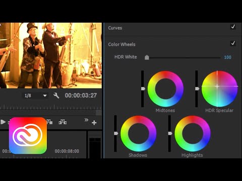
It turns out that the sticks don’t separate all too well from the background. But now that you can control the Lumetri Color Panel with all of its settings directly from within After Effects, it is very simple to see if some simple changes can make a difference. In this case, the highlights have been brought back up to create a bit more background separation, and it adds a really nice soft and creamy touch to the highlights in this image in general:

Coming soon to Adobe pro video: a re-definition of high definition. Read up to see what else is coming to our video and audio tools, and watch this short overview video introducing key features.