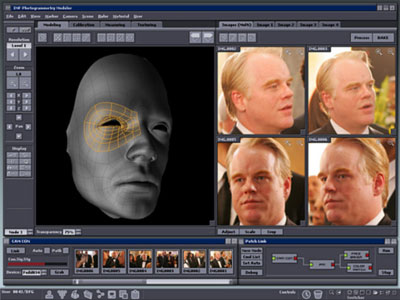
We’ve all noticed the really bad “you’ve got mail” computer and data display screens that pop up in Hollywood movies. What we tend to miss are the really good ones, which are realistic. (Fun fact: Stanley Kubrick insisted that all of the displays shown in 2001 be plausible, including reflecting the correct state of the planets etc. at the point during the trip when they appear.)
One of the best designers of these screens is Mark Coleran (who currently designs real-world user interfaces for Gridiron Software, including Flow). Mark was recently interviewed by both NPR and Spark, where he shared some insight into his craft. (I’d suggest following the above links in order, as it starts with the eye candy and ends with his unabridged analysis.)
Interesting is that there’s been a lot of backlash to his NPR interview, as some have used him as the public face for all of the bad movie screen design that is out there. Some of the criticism is unfounded; some of it is simply the result of the common situation we all face in delivering what the client wants, for better or worse. As Mark recently commented in his defense on an After Effects forum, “I and the others who do and did this stuff spend a long time trying to haul it back to reality. Perhaps the story aspect is a post-hoc rationalization, but the requirements are very different.”
Regardless of whether or not you like the result, Mark is one of the best After Effects artists out there, with a fantastic emphasis on both detail and efficiency. If you ever get a chance to see him talk live about screen design, do so.

