Color comparison tests are hard. Color science is witchcraft, and objective color is exceedingly difficult to quantify. Comparison is really the only way to judge color, so we tested ten LED lights against two tungsten Tweenies and a 3200K 2’x4 Kino Flo. The results are… interesting.
While shooting this test we had a break while waiting for one remaining light to show up. Fellow PVCer Adam Wilt had suggested shooting a flesh tone test as there’s no other material that acts quite the same way skin tone does: not only is it a unique substance whose spectral response can’t be emulated perfectly by a piece of colored cardboard but it also has layers that scatter light in unique ways. We turned the camera around and created a simple setup in a corner of the studio and, using production manager Emily Pierceall as a model, we quickly shot tests with every light we had available.
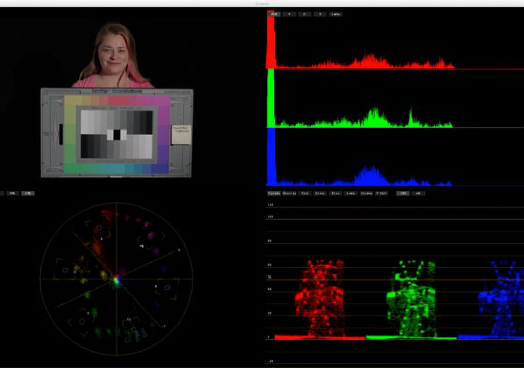
We shot this on an Alexa in Rec 709 mode (to ProRes4444) and the camera’s white balance had been set for the previous test using the same two tungsten Tweenies. The white balance did come up a little on the cool side so I pulled the clips into Apple Color and graded the tungsten clip to be neutral. I then copied and pasted that correction onto all the other clips.
The neutral tungsten reference.
The setup used only one light at a time, as we only had a half pair of several fixture models and I wanted to keep the setup fast and simple:
I have a chat with production manager Emily Pierceall, who was kind enough to sit in for the test as she was by far the prettiest member of the crew.
As you can see we improvised a bit, given the sparse materials at hand. I wanted to create a setup that looked nice but only required one light. One piece of scrap foam core became a fill source, another became a hair light, and a piece of shiny Rosco bounce material became a scratch. The hair light bounce is barely noticeable but it would have been more noticeable if it wasn’t there: most rooms have white ceilings, and while ceilings aren’t an obvious light source unless they are specifically lit they do provide some “presence” that’s noticeable in its absence. Without some kind of white material overhead hair becomes dark and upward-facing surfaces lose their lustre. It’s not obvious what’s missing but it’s clear that something is wrong.
In this case it wasn’t necessary to add this “presence” as this was simply a test, but I’m picky about such things. (You can see some of the “presence” I’m talking about in the photo above. Look at the hair on the top of Emily’s head.)
By using only one light for the setup I was assured that there would be only one color of light in the set. Foam core and the shiny bounce have some effect on color but as these are materials used on sets every day I felt that any slight color shifts they caused were acceptable.
Whereas in the previous test I kept the same T-stop and changed exposure using the camera’s electronic shutter, I wasn’t as concerned about optical anomalies here. The other test had to be done that way as the results were to be put into a color-critical matrix for comparison, but in this case we were just looking for overall color shifts and I wasn’t as concerned about vignetting or constant depth of field. As a result the chart will change sharpness from shot to shot depending on the T-stop. (The camera was an Arri Alexa with an 85mm Arri/Zeiss Ultra Prime. We recorded Rec 709 to ProRes4444.)
Having said all that, let’s move on to the actual test images. I’ve paired each light with a tungsten reference as comparison is the only accurate way to see subtle differences in color. I present these images without comment so you can make up your own mind as to what you like and what you don’t. Turn the page to start…
You can download a larger PDF version of the chart here. Please don’t distribute this image by posting it elsewhere as that robs me of traffic; instead please direct others to this article. Thanks!
The behind-the-scenes photo used is ©2012 Adam Wilt and used by permission… and with many thanks.
Disclosure: I was paid to perform this test by PRG.
Art Adams is a DP with an appetite for human flesh… tone. His website is at www.artadamsdp.com.

