Colour correction is one of the most important aspects of compositing and visual fx. This quick tip will show you the best way to begin colour correcting different layers in a composition – just by pointing your mouse.
When compositing different elements together, it is important to colour correct them so that they all match. This is a fundamental aspect of visual effects, and After Effects comes with many different tools to help colour correct and colour grade your footage. When dealing with many elements from different sources, it’s normal for the colours to vary quite a lot, and without colour correction the resulting composites can look laughably bad.
When colour matching different layers, one commonly promoted technique is to use a split screen while matching the Red, Green & Blue channels individually with the levels or curves effect. While this is a very powerful technique, it can be difficult to match similar elements precisely. But by using a basic feature of After Effects and just the mouse pointer, it’s possible to get much better results – faster, and easier.
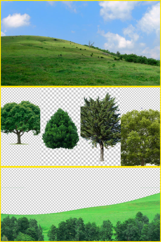
To demonstrate this quick tip, I’ve mocked together an example using a fictional landscape composition. It’s easy to think that “the sky is blue and the trees are green”, but as you will see from the raw source images, there are many types of green.
This simple example, using two different photographs of grass and a few stock-footage trees, clearly demonstrates that we need to adjust the colours of each layer so they match. With the layers simply stacked on top of each other without any form of colour correction, the different colours stand out and look unnatural.
The basic composite, without any colour correction.
While the more popular colour correction plugins are curves, levels and colour balance, these all work using R, G & B channels – and this isn’t always the most intuitive way to manipulate colours. While powerful, once you consider the shadows, midtones and highlights of the R,G & B channels, it’s fairly tedious to juggle nine seperate values simultaneously.
The trick, therefore, is to leave RGB colour correction for step two, and to begin with a much easier and faster process – simply matching the basic hue of each element first. Instead of adjusting the individual red, green & blue channels of each layer, we start by doing an overall hue-shift. The hue is a single parameter, there is only one value to adjust. This is a broader, more general way of aligning the colours in each layer and provides a base from where we can continue to do more refined and precise colour correction using levels, curves, colour balance or any other tool.
The other vital tool for this technique is simply the mouse pointer – the After Effects info palette displays the colour values beneath the mouse pointer, and by default it displays Red, Green and Blue values.
The default info palette – displaying the RGB values under the mouse pointer.
But by clicking on the palette’s options, we can change this default behaviour. This is useful if you prefer to work with decimal colour values (ie 0 – 1), or if you’re working at 16bit depth but prefer to see the colour values in regular 8 bit (0 – 255).
In this case, the quick tip is to change the readout from RGB to HSB, so instead of individual RGB channels, we can see the hue, saturation and brightness by moving the mouse over our composition. By positioning the mouse pointer over different layers in the composition, we can see how different the hue values are, and then we can use the Hue/Saturation plugin to adjust them accordingly.
The info palette is now showing colours as hue, saturation and brightness.
We can also apply a temporary blur effect to each layer, so we can get an idea of the average hue. All we have to do is move the mouse over the composition and look at the hue values in the info palette. In this case, after heavily blurring the background layer we can easily see that the “average” hue of the grass is 95 degrees.
However if we compare that to our foreground layer of grass, we can see the average green is 110 degrees – quite a substantial difference.
To align the two layers, all we have to do is apply the Hue/Saturation effect and change the hue accordingly. The difference between 110 and 95 is 15, so we can begin with a setting of -15 degrees on the foreground layer. The two layers now match much more closely.
We can continue to do this with our other layers, and once we have aligned the different hues using the hue/saturation effect, we can delete the blur effect.
The basic composite, without any colour correction.
…and with all layers Hue shifted to match each other.
With our initial correct having bought all of the elements closer together, we can look at using levels or curves (or your favourite colour correction tool) to continue refining the composite.
So while levels, curves, colour balance and other colour correction plugins provide very powerful tools for matching different elements, the overall process will be much faster if the first step is to match the Hue. And by changing the info palette to display HSB values, we can use the mouse pointer and the Hue/Saturation effect to quickly and easily bring our layers into colour alignment.

