The transition from film to digital video has created a shift in the filmmaker’s relationship to color.
In Part 1, we interviewed Lars Borg, Principal Color Scientist at Adobe, about the intriguing field of color science. In this post, Lars shares a few things that everyone working in video ought to know about color science.
We learned from Lars that “color” is actually an interplay of available light, colors, and the context in which we see them – all of which makes color subjective to a lot of different variables. We wanted to know, with such a deep topic, what ground rules can filmmakers and video enthusiasts derive from color science when it comes to basic color correction and color grading?
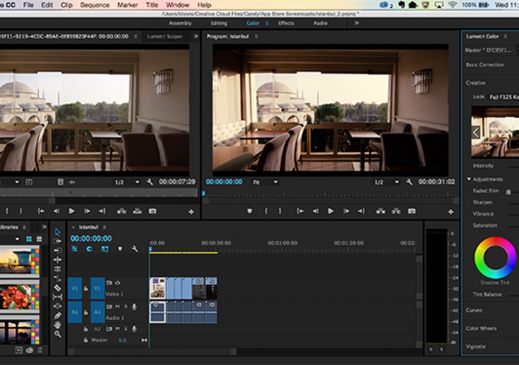
Looks are essential in cinematic storytelling
In the past, the film stock played an integral role in creating the “look” or character of a film. In the transition from film-based movie making to digital video, our relationship to color has shifted too. “The concept of the look is integral to film-based photography. You’d pick your film stock, say Fuji Velvia or Kodachrome, because the resulting look was pleasing to you. Some of the ‘look’ stems from the fact that the film’s spectral sensitivities don’t match the eye’s.” For example, some film stocks are overly sensitive to red, resulting in richer skin tones. Now, digital systems can emulate the look of film stocks.
Look preferences vary by region and change over time. “It seems like there has been a slow shift towards more accurate colors in reproductions, partly enabled by highly color-accurate digital cameras.” Lars muses, “I recently flipped through a cookbook from the 60’s. Some images looked awful against my current preferences – too much contrast, unnatural colors. Not something I longed to eat. Contemporary food pictures seem to be much closer to the actual food colors.”
“A Look can change a day-time scene to a night scene, or turn back time by applying a sepia tone. The color palette could change as the main character goes through different phases of life, from hardship to happiness and back. You can tell the intended mood of a scene from its Look alone. The villain’s lair is dark, gritty, contrasty, de-saturated, while his unsuspecting victims live in a bright, colorful, low-contrast, Disney-esque world. A grim Look is used for the kill.” This concept of storytelling through motifs isn’t confined to visuals or cinema – think of the musical cues of an opera, or the soundtrack leitmotifs in a TV series.
How far back does this concept go, Lars wonders? “Did the cave painters use Looks? Needs further study. Looking for sponsors.”
Want to capture custom Looks easily? Try the all-new app, Adobe Hue CC!
Contrast and saturation matter
Viewers have come to expect Looks or image enhancements. In today’s world of RAW media, images with no color correction often look flat, and viewers almost always prefer a bit of a contrast boost. “This might simply be because it’s easier to see the details when the contrast is higher,” Lars says. So if you do nothing else, don’t be afraid to tweak the contrast.
Manage your editing space…
“We know that if you take an image or an object, and make the surrounding brighter, you perceive the object as being more colorful.” Even if you have a perfect calibration, and are working under color management, if you are working on a video at home under inconsistent lighting conditions, contrast will appear radically different from day to night, “So aim for a consistent viewing environment, where the lights are controlled and low.”
… and adapt your media to the viewing environment
“To some extent, a filmmaker creates an environment and a context.” But the filmmaker also needs to consider the conditions under which their media will be viewed, and try to optimize for that experience. Will your target audience be watching on the big screen, or on a mobile device?
Back in the ‘50s, TV studio cameras were pretty insensitive to light, and television screens themselves were fairly dim. “For people viewing in the living room, the colors appeared desaturated—they were not the same bright, compelling colors that were actually present in the studio. So the TV system included a Gamma adjustment to increase the contrast, making the images more compelling, as well as boosting the saturation slightly, so in the living room, they looked more like what you would expect and prefer.”
Color management is important.
“You can give someone three RGB values, which you might think is a well-defined color, but it’s actually specific to the video standard that you are using,” Lars says. If you switch from HDR (high dynamic range) to digital cinema for example, the meaning of that RGB triplet changes, even if the proportion of reds, greens, and blues remains constant. “Colors are like a currency exchange rate. Say I have $50 in my pocket, but is it Australian or Canadian dollars? You need to know which to evaluate the true value. Your color management system is the currency exchange for RGB values. And if your display drifts, its ‘exchange rate’ drifts, too.” Not surprisingly, when it comes to color, it’s all about context: “With Ultra High Definition TV, colors can be more saturated. With HDR, they can be much brighter. If you go to digital cinema, it’s something different again.”
What do you think of these key takeaways? Let us know in the comments below. And, if you missed it, read Color Science, Explained (Part 1).

