DaVinci Resolve was used by EC3 dailies colorist Adrian DeLude for near set dailies grading on the Twentieth Century Fox blockbuster “X-Men: Days of Future Past.” EC3, part of Deluxe Entertainment Services Group’s near set dailies offering, harnesses the technology and personnel of post houses EFILM and Company 3 to create custom configured dailies solutions for feature films. Colorist Stephen Nakamura, who has done the DI grade on almost every feature Sigel completed digitally, also used DaVinci Resolve for the final DI grade of the film at Deluxe’s Company 3 facility in Santa Monica.
We talked with Adrian and Stephen about their careers, how can color affect an audience’s perception and about the best part of being involved in the creation of X-Men: Days of Future Past.
ProVideo Coalition: Tell us about your career. How did you get involved in the industry?
Adrian DeLude: I graduated in 2000 from the AFI [American Film Institute] with a masters in cinematography. I was very interested in how post relates to cinematography and I was lucky enough to get a job as a telecine assistant right away doing feature dailies. I moved around to different companies, always doing feature dailies, until I came to Company 3. I’ve been here for about eight years.
Stephen Nakamura: I started color grading in the ’90s, before it was possible to do it for feature films. I worked on a lot of major music videos and commercials and DVD releases of movies. I worked for some high-power filmmakers like David Fincher. So when people actually started doing digital color grading for features, I was one of the first to transition into that job. I did the first DI for David and quite a few other major directors and cinematographers. I worked with Tom [Newton Thomas Sigel, ASC] on his first digitally-finished features, including Confessions of a Dangerous Mind, which George Clooney directed. The technology was very new then and Tom wanted to really push it to its limits.
ProVideo Coalition: What’s a common misperception people have about color and its use?
Adrian DeLude: A lot of people think that color is just about “fixing” or “correcting” mistakes. But coloring is a major component that helps filmmakers tell their story.
Stephen Nakamura: Some people don’t realize how much darkening a little shadow over here or desaturating a part of the frame there can affect the whole meaning of a scene. I love visual art and I’ve been fascinated by powerful cinematography all my life – the way you can look at a scene of a movie or TV show with the sound turned off and the way it looks says so much about if the scene is serious or funny or scary. Obviously, the overall effect is the result of writing and acting and production design and many other factors. But the look of a shot is so full of information and as a colorist, I get to be part of building that look.
Adrian DeLude: Color and contrast affect how we look at a scene, where our eyes go within the frame and how we feel about a situation. Filmmakers have always controlled how bright or dark something looks, how much falls into shadow, how inviting or ominous an environment feels. It used to be most of that happened through lighting and exposure and those things still play a pivotal role. But today, those attributes can also be significantly altered through color grading.
Dailies grading has traditionally been more global. We’d work mostly just in primaries (affecting the whole image rather than isolated portions) and the goal was to create a version of the material that shows everyone in the production what’s there with maybe a suggestion of where it could go during finishing. Today, we’re also starting to do more fine-tuning if that’s the way the filmmakers want to work.
Stephen Nakamura: On a purely technical level, a movie that hasn’t had the “polish” of a good colorist will very likely have shots that look mismatched, which draws attention away from the story. But then on a more sophisticated level, the color work can help make a scary scene scarier or a romantic scene more romantic.
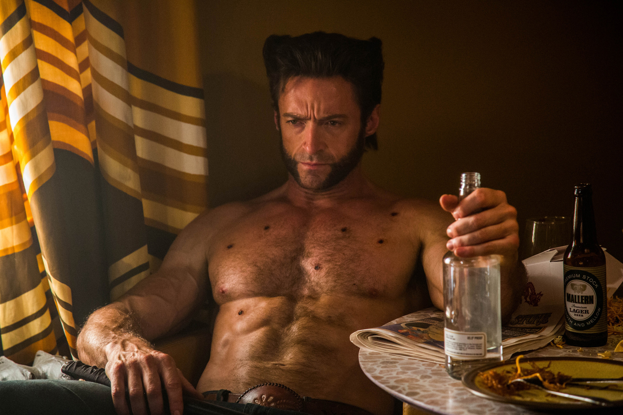
Color also helps orient the audience when there are multiple stories and time periods going on at once. In X-Men: Days of Future Past, we established a different look for the 1970s portion of the story and the parts set in the future. The looks help the audience feel where they are in the story without having to be told through title cards or dialogue.
ProVideo Coalition: What was the best part of being involved in the creation of X-Men: Days of Future Past?
Adrian DeLude: The project was huge and everyone involved was very creative and inventive. People like [Newton Thomas Sigel, ASC] and Bryan Singer are very interested in pushing the art and the technology and it’s always rewarding working in that kind of environment.
Stephen Nakamura: I always love working with Tom. He’s shot a few of the films in the franchise but he never just rests on the look he set before. He’s always working on creating a look to help the story of the particular film. I always like working with him because he’s always interested in seeing where the technology can be used to enhance the art so everything I do with him is rewarding artistically.
ProVideo Coalition: Is it intense to work in a near set dailies environment?
Adrian DeLude: Of course it is. The people who are shooting all day are very eager about seeing their dailies quickly. But when you’ve got someone like Tom there asking to push the technology as far as it will go, it’s also incredibly rewarding. You have to be very comfortable with the technical and creative possibilities to work in this kind of environment. So you still have energy left over to go further. That’s where it comes in handy that I’ve graded many thousands of hours of dailies.
Stephen Nakamura: It gives them an opportunity to try a “first draft” approach to the movie’s color. No matter how talented and creative a cinematographer is, the final color sessions will be more effective and efficient if he or she has comes in with a strong sense overall of what they want. We might take the ideas in another direction but it was great that Tom had had the opportunity to really work through certain ideas so they were really developed by the time we started the final grading.
ProVideo Coalition: The film was shot by Newton Thomas Sigel, ASC, and you mentioned that he could come over during lunch to supervise. Did that change your approach to your work?
Adrian DeLude: It made the collaboration more interactive. We talked about aspects of color grading I almost never hear about in my capacity as a dailies colorist. He would talk a lot about isolating particular colors to enhance the color contrast in an image and picking out particular hues to shift in a certain direction. It was both challenging and freeing.
ProVideo Coalition: Tell us about the final DI grade of the film. Was it a process to get there?
Stephen Nakamura: It’s always something of a process but a big part of that had been worked out with Tom and Adrian already. By the time we worked on the 1970s portion, for example, Tom had seen the story with the very saturated “Kodachrome” look and had decided instead to go with a more desaturated feel for all but a few key colors that we isolated to make them “pop.” So certain iconic 1970s colors stood out while we desaturated the rest. It wasn’t really about him changing his mind as having time to develop the look.
ProVideo Coalition: Why is it rare to do so many secondaries in dailies?
Adrian DeLude: Traditionally, it’s been more of a technical challenge track all these color decisions through to the DI, but that’s not really an issue anymore. Also, if you’re not actually sitting in a room with the cinematographer, it can be extremely difficult for him or her to convey very subtle ideas about color. Terms like “warmer” and “cooler” and all that are very general. Unless the dailies are graded in close collaboration, as we had on X-Men, where there’s true interactivity, it can be difficult to get exactly what the DP wants in the secondaries. People would tend to be safer. Also, some cinematographers just want to see dailies with very limited grading. But in an environment like we had with the EC3 trailer, it works perfectly.
Stephen Nakamura: I’ve used DaVinci Resolve for color grading pretty much my whole career. I know there are other great tools out there but DaVinci Resolve has usually been ahead of the game in development and I’m just so used to the way it’s laid out and the workflow that I can work extremely fast with it.
ProVideo Coalition: Tell us about the experimentation you were able to do with your ideas for “looks” during dailies creation. Did many of those ideas make it to the final version?
Adrian DeLude: Tom had this whole vision about the material set in the 1970s having a kind of “Kodachrome” feel. Tom brought in a lot of pictures from the 70s, particularly those by William Eggleston, and we designed a way to achieve a similar look in DaVinci Resolve. We pulled color out of shadows, adding softness to the highlights and then we’d push the greens more toward yellow-green, blue in the direction of the hue from Pan Am’s logo and we’d give the reds a rich, primary red look. That didn’t make it into the final but it helped Tom work through his ideas.
ProVideo Coalition: What advice would you give to someone who asked about how they’d be able to work on amazing projects like X-Men: Days of Future Past?
Stephen Nakamura: I wish I had a great answer but that’s a tough one. The only thing that I can say for sure is that it won’t be the way I did it or most of the other people like Stefan Sonnenfeld and the rest of us who are fortunate enough to color a lot of the major studio features today.
We started out doing color grading for TV and DVD releases and we colored millions of feet of film dailies that used to be part of the film and TV industries. That kind of training ground isn’t the same anymore. But there are still great companies like Company 3 and we have a lot of people in assistant and support positions who will be doing this kind of work in the future.
It’s still an exciting field for people who have a knack for it and are willing to put in the hard work.

