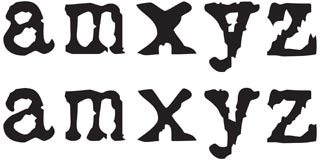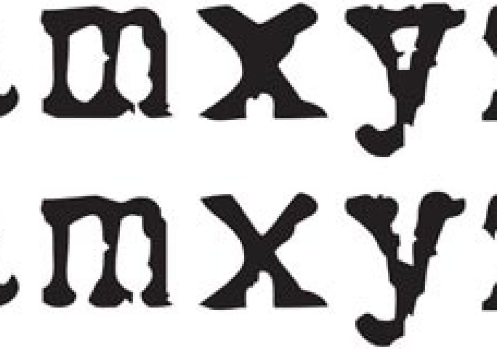
The LoveLetter Typewriter font had a few characters that were difficult to read (top line) until they were modified (lower line).
When planning a new project, the font you choose can lift a design to a new level, or add an all-important attitude. So when you’ve spent hours picking a font that the client agrees is “just perfect,” panic can set in when they object to a couple of characters as being too weird or difficult to read. The more high profile the job, the fussier the client will be; after all, if they’ve paid millions to open their movie with the name “Zellweger,” the Z better look good! Rather than picking a different font and possibly disrupting the schedule, an hour spent editing the troublesome characters can save the day.
Those who have edited fonts in the past may be familiar with Fontographer, which unfortunately languished for several years without updates. The new kid on the block for professional font designers is FontLab Studio. For the type of font editing we do, its high-end features and $649 price tag (as of early 2008) is a little steep. So thank goodness for its little sister, TypeTool: a “light” Mac OS X and Windows compatible font editor for just $99 (again, as of early 2008).
We mostly use TypeTool for modifying fonts for legibility (see the LoveLetter example at the top of this page) and improving a confusing character (such as a “t” with a very short crossbar). If you have an alternate or swash version of the font, you might want to create a custom mix of your favorite characters (see below). You can even paste in logos, Euro symbols, accents, special punctuation, or custom bullets into rarely used characters of your company house font for added convenience. As another example, the After Effects Numbers plug-in can create random text animation from the numbers 0 through 9. By copying and pasting dingbats from various fonts into these slots, you can create a custom font for use with Numbers (also below). Ditto with pasting icons into the 0 and 1 slots for use by effects that randomize binary code.
The Mason Sans font from Emigre comes with an Alternate version. If you prefer a few of the alternate characters, copy and paste them to the regular version and save a custom mix. Note that we straightened the bar on the H and removed the center bar from the Z in our custom version.
The Cage set of fonts from P22 is based on the handwriting of John Cage. We moved our favorite characters (upper line) from the Extras font to the 0-9 slots so that the Numbers effect in After Effects could randomize them. The original characters from the number slots are shown on the lower line.
So if you’d like to add “Font Wrangler” to your resume, follow along and we’ll show you how easy it is to perform simple modifications to Postscript Type 1 and TrueType fonts using TypeTool. Download the demo version so you can explore as you read, but note the restrictions on saving a usable font with the tryout version.
Using TypeTool
Remember that if you’re not designing a font from scratch, you only have to know enough to be dangerous! Speaking of danger, know that you can’t accidentally damage the original font – it is imported into a TypeTool project file for editing. That said, we suggest you make a new folder and copy a duplicate of the original font into it for reference; this folder will also hold the TypeTool project and the new font(s) you’ll generate.
The font table window in TypeTool 2 showing the original P22 Cage Extras font; we later moved the musical notation marks in line 7 to the number slots in line 4 for use by the Numbers effect. (Click on the image to see it full size.)
Open the font you’d like to customize in TypeTool (File > Open); if it’s a Postscript Type 1 font, open the printer font (not the screen font). Unless you speak fluent Unicode, set the Mode popup at the bottom of the main font table window to Names (seen at left). Select File > Save As and save the TypeTool project as “FontName.vfb” inside your new folder (the name of the project has no impact on how the new font will appear in your font menu). Now you’re ready to get to work.
Characters in TypeTool are referred to as “glyphs.” Double-click any character to open it in its own Glyph window (shown below). The Edit (arrow) tool can be used to move individual points; other tools are available for scaling, rotating, and so on. Note that if you delete a point, the segments before and after automatically join up (they don’t leave a gap). Get in the habit of saving your project file after you’ve edited each glyph.
The Glyph and Metrics windows in TypeTool 2; the width is being adjusted numerically to 500 units in the latter. (Click on the image to see it full size.)
To copy the entire glyph, Select All and Copy. To move glyphs, copy and paste them between Glyph windows or from the font table window; use the arrow keys on your keyboard to nudge a selected glyph into position in the Glyph window. To import glyphs from a different font, open a second font and copy from one to the other.
After editing or pasting glyphs of different sizes, you may need to change the character width (the space the character will take up when placed side by side with other characters). To do this, move your cursor over the dashed line to the right of the character in the Glyph window, and drag the right margin. As you drag, the new width value will be displayed in the upper left corner. Enlarge the Glyph window to drag in finer increments. To set the width numerically, open Window>New Metrics Window and enter an exact value in the second field (see figure above).
Naming Rights
It’s very important that you rename your new font to avoid confusion; this also allows you to install both the original and the modified font at the same time. In the File>Font Info dialog, fill in the Family Name, Weight and Width fields. The Font Name is used by a Postscript print driver so do not include spaces in this name. The Menu Name should match the Family Name. The FOND name is used by the Mac OS to organize fonts into families. (Open a few different fonts and check their Font Info dialogs to get a feel for naming conventions.)
You can assign any name to your modified font, and if you want it to sort under a special name (such as “ProjectName”) then go ahead and enter a unique Family Name. However, if you retain the original Family Name, your font variant should sort under the same group in an application’s Font menu. (According to Fontlab, Windows users may need to put variants into a separate family, as the OS recognizes only the variants bold, italics, and bold italics.)
If you are editing an existing font for personal use, retain the information in the Copyright and Designer panels to avoid copyright infringement.
Talking ’bout Your Font Generation
Save the TypeTool project, and keep this file in case you need to regenerate the font using different output options. Last but not least, generate your new font: If saving the font on Windows, choose File > Generate Font and save as TrueType or Postscript Type 1; on Mac, choose File > Generate Mac Suitcase and select the format from the popup.
While TypeTool can convert between Postscript Type 1 and TrueType type formats, they are encoded differently, so we suggest you save a modified font in the same format as the source unless you have a good reason not to (such as when a plug-in reads only TrueType fonts). In general, Postscript Type 1 is a more accurate format, so converting from TrueType to Type 1 should be okay. Going from Type 1 to TrueType may result in a slight rounding off of characters.
Install the new font as you would any other font. Be sure to install both the old and new fonts so you can check that the fonts don’t clash and that they are grouped as expected in the font menu. If not, edit the names in the Font Info dialog and regenerate.
Check the TypeTool manual to better understand the various editing tools, font metrices, font naming, and other subjects we’ve touched on here; there are also Flash tutorials online. But we hope this overview will give you the confidence to font wrangle a few characters when you find the “almost perfect” title font for an important project.
Postscript: Font Resources
Can’t get enough of fonts? We maintain a page on our web site with links to our favorite fonts and font resources.
The content contained in our books, videos, blogs, and articles for other sites are all copyright Crish Design, except where otherwise attributed.

