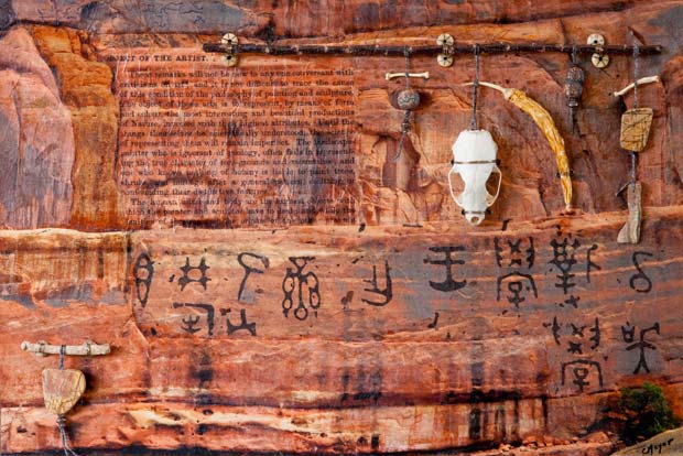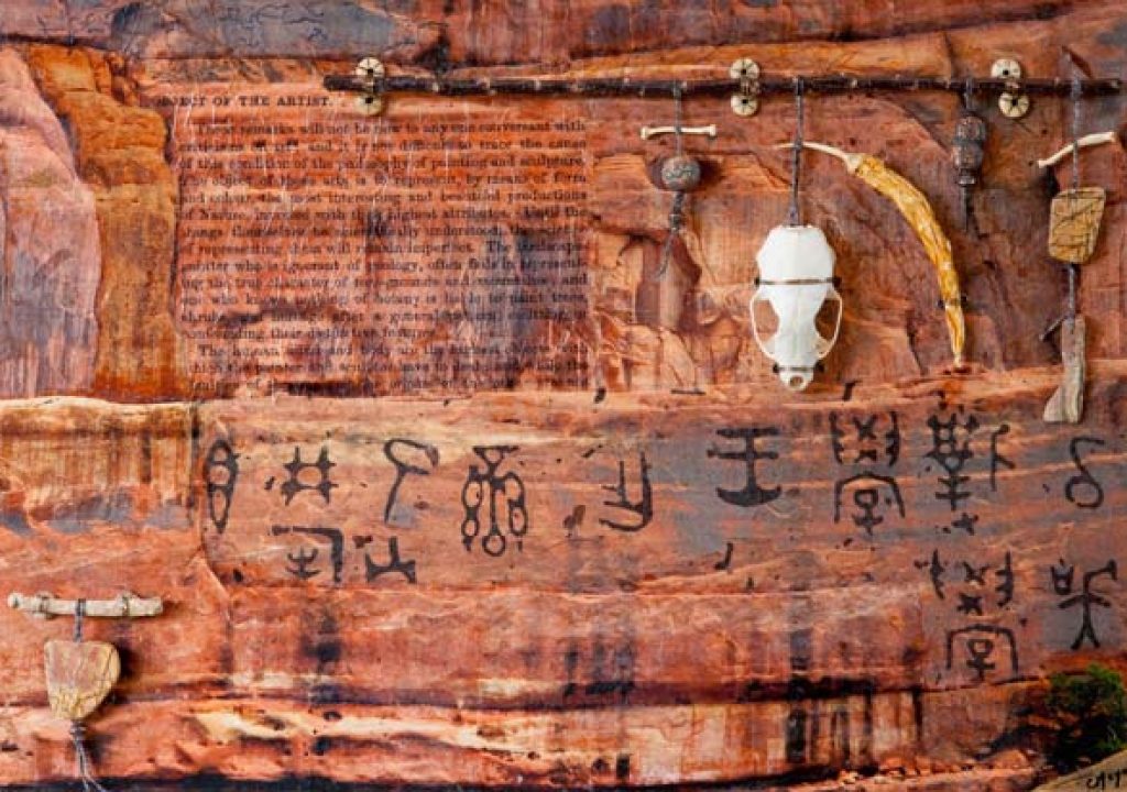
Ever have one of those pieces that you put in a drawer for a couple of years, pulling it out periodically only to shove it back in because your head wasn't in the right space yet to deal with it? That's the underlying story behind this piece, The Object. In this case, it wasn't just the image I was having trouble with – it was also the text I decided to attach to the image to give it a story. But sometimes, you just have to challenge yourself.
In this article, I want to share both the technical details of how this piece came together, as well as my internal conversation over the nature of abstract art and how it relates to photography.{C}
The Wide Shot
Most of my recent photography-based mixed-media pieces – such as Seeking to Understand and Avian Aspirations – use close-ups of the cracks, veining, and strata in rock as the structural pattern for my shapes. Combined with cropping that hides the edges, perspective is removed, helping to abstract the shot. However, every now and then I back up, widen out the lens, and shoot a mountainside for my patterns. I still crop out the ground and the sky, but the scale is much different, and the underlying image is often more recognizable as being a mountain rather than just colors and shapes.
In the spring of 2009, we visited Arches National Park in Utah. In addition to its namesake arches, there is also a wonderful section known as Park Avenue which contains a number of huge, monolithic slabs of rock arranged at varying angles:
As you can see, it was an overcast day, which resulted in a featureless sky and lack of strong shadow patterns. This would normally be a bummer for nature photography, but actually helped in creating evenly lit surfaces for me to work with.
A large section of one of these rock faces served as the underlying photo for this piece. Here is the untouched Camera Raw file; the gnarled tree in the lower right helps give a sense of scale:
A problem with the flat lighting was a corresponding lack of vivid color. I increased the contrast and saturation to give myself more variety in the values and hues:
As this was shot with an older Canon 10D DSLR with a maximum of 3072 pixels, I restricted myself to a print size of 12″x18″ so I could get at least 150 dpi resolution for the print (I prefer at least 200 dpi for sharpness; 100 dpi tends to be too soft). I printed a pale version on heavy art stock as my “paint by numbers” guide, and then turned to deciding what papers to tear to match the patterns in the rock.
Shooting the Message
I often like to include text as part of my collage “underpainting” to help hook in the viewer. Sometimes I use foreign languages and alphabets to evoke a sense of mystery; sometimes I use explicit texts in English to set the mood for the rest of the piece (such as was the case for Avian Aspirations).
For these texts, I rely on old dictionaries, encyclopedias, and textbooks, both to ensure the sources are in the public domain, and also to present a different take on what may now be commonly accepted knowledge. Sometimes I borrow from fringe practices, such as phrenology which opined you could determine a person's behavior by the details in the shape of their skull.
As part of this study, I came across the writings of the influential phrenologist George Combe, who assembled a number of his earlier submissions to The Phrenological Journal and Magazine of Moral Science into a small tome titled Phrenology Applied to Painting and Sculpture, released in 1855. It includes a passage titled “Object of the Artist.” In it, Combe – a self-admitted novice in art, who was appalled by the reliance on opinions and impressions over reasons and principles in the field of art criticism – states:
The object of these arts is to represent, by means of form and color, the most interesting and beautiful productions of Nature, invested with their highest attributes. Until the things themselves be scientifically understood, the science of representing them will remain imperfect.
Although there are certainly excellent representative-style artists who hone their craft by studying the makeup of their subjects in intimate detail, such a statement denies entire fields of impressionistic, expressionistic, abstract, and other non-representative art. Indeed, the equation of art to the “science of representation” is enough to cause many to bristle.
The irony, of course, is that photographers – by the very nature of their craft – are usually involved in representative art. Then how dare I call myself an abstract artist, when the source of most of my recent work has been photographs?
This inner conflict was recently resolved when I read Fran Boas' classic (1927) text Primitive Art where he states up front that “It is essential to bear in mind the twofold sources of artistic effect: the one based on form alone, the other on ideas associated with form.” I indeed focus on the ideas as much as the form. For example, when I take a photo of a bird, I am not as interested in the object “bird” as much as trying to capture a movement, pose, or expression that yields insight into what the bird might be thinking – the essence of the bird in that moment. Many accomplished photographers have he same goal: to get at the essence of the scene or being they are photographing; not just the surface appearance.
Additionally, one must keep in mind that Combe wrote “Object of the Artist” well before modern or abstract art became major forces, let alone were widely accepted as legitimate forms of artistic expression.
Still, although I felt compelled to use Combe's words to compel the observant viewer to think, my own issues with their assertion kept this piece in a drawer for nearly two years. I finally made peace by accepting the irony of creating a piece of abstract art with these words at its core, and pushed forward.
next page: creating custom collage papers from scans; assemblage and framing decisions
Improving Upon Reality
Some mixed media artists like to tear pages out of old books and use them directly in their art. I tend to avoid this for a couple of reasons:
- Most books are not printed on acid-free paper. This means they will yellow and decompose over time, potentially affecting the paper around them as well. (Although buffering agents such as Archival Mist or Bookkeeper can help prevent this.)
- The original text may not feature a size or arrangement that best suits the finished piece. For example, the words may be too large or too small in relation to the overall work.
- Once you've used a favorite page – say, to pluck out one word from a dictionary – it's gone, unless you can find and purchase another copy of that book.
Therefore, I prefer to scan in my sources pages – usually at 600 dpi to have lots of resolution and therefore flexibility to resize later. I then make test prints at various sizes on ordinary paper, laying these on top of the printed reference photo to see how they fit. Once satisfied, I'll then print the manipulated scan on acid-free paper that might also have a color or texture that better suites the piece. In particular, I like printing on Japanese kinwashi or ginwashi, which have very prominent fibers for texture while also being stiff enough to safely travel through a printer.
Below is a before and after comparison of the Combe text referenced above. On the left is a scan of the original page; on the right is a cleaned-up version where I subtly widened the text slightly to better fill the space reserved for it, removed the page number, emphasized the title, and shifted the title to the left – again to better fill a nook inside the underlying photo:
As described previously in the post on my piece Seeking to Understand, other papers were then chosen to vary the texture and tint across the otherwise uniform color of the rock in the original photo. One of the papers featured various pictograph symbols – I enjoyed the inside joke of including examples of primitive art to juxtapose with Combe's text about refined art. The final collage was then lightly coated with Golden Digital Ground to better receive the ink of the rock photo, which was printed on top of the collage.
The result was then fixed on a masonite panel for stiffness. To avoid “SID” (Support Induced Discoloration), the masonite was first treated with two coats of Golden GAC 100 to make sure brown spots didn't migrate from the wood through the paper. After mounting, the paper was sealed with an acrylic gel topcoat that included UV protectants.
Final Assemblage
After wrestling with the theme of the text I chose, in the end I chose to run with it when it came time to selecting what materials to add on top of the collage/photo composite. As the text suggested an artist must be intimately aware with the subject they are representing, I chose samples of animal (coyote and mink bones), mineral (pieces of jasper) and plant (fibers, wood, and a pepper pod) for my assemblage. Continuing with the inside joke about primitive art, I also included beads with ancient symbols carved into them. The contrast between the dimensional, bone-white mink's skull and the flat, darker orange print obviously made it the focal point, becoming a second interpretation of the piece's title: The Object.
As can be seen above, I mounted the panel in a “floating” frame, exposing the assemblage elements and the texture of the papers to the viewer rather than hiding them behind glass or plastic. This mounting is obviously exposed to the elements and more fragile to transport, but I feel the ability for the viewer to more closely interact with the piece yields a far more compelling result.
This panel in this piece, like the others I've discussed recently, is 12″ x 18″ – a limitation I imposed on myself based on both the resolution of an older camera (a Canon 10D) and the width of our older printer (a 13″ Epson 2200). Now that I have a camera with more pixels (Canon 5D mkII) and a wider printer (24″ HP Z3100), the new series I'm working on is being created for 16″ x 20″ panels, with a goal of working up to 18″ x 24″ by the end of next year. I've encountered a few issues working at this larger size; I'll share more details once I've worked through some of the problems and have some finished pieces to show.
things to come…
Our photographs and artwork, as well as content contained in our books, videos, blogs, and articles for others sites are all copyright Crish Design, except where otherwise attributed. Other examples of my mixed media work may be found on my artist web site.

