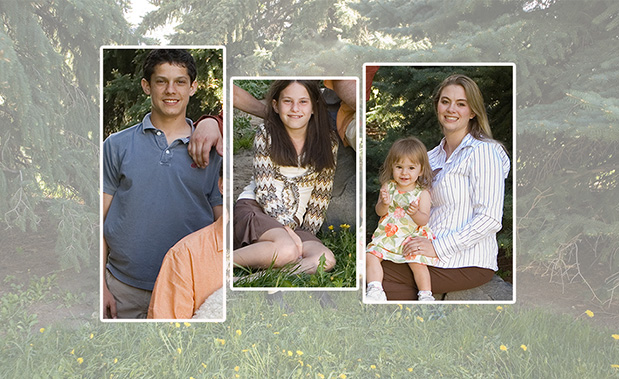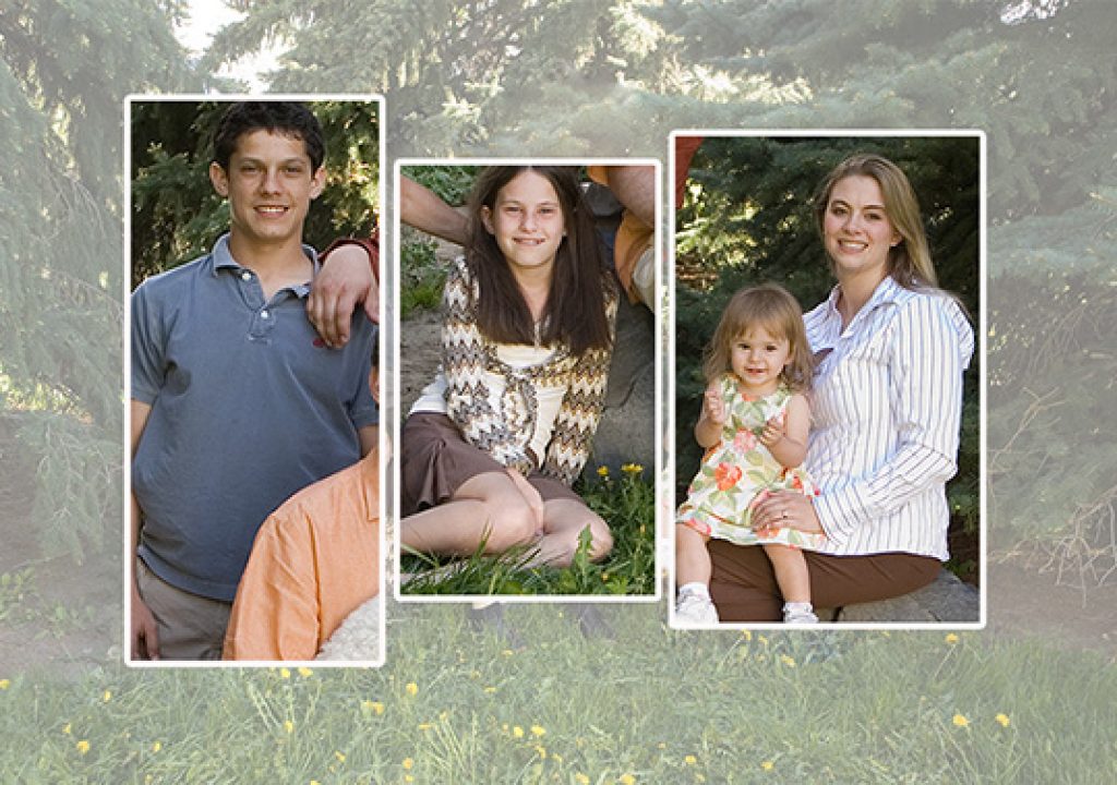
Here’s a typical case of disparity of clothing color and pattern for an important portrait. Shown right next to each other, it’s obvious how incompatible clothing color and style can be.
Here are some thoughts about how to try to avoid these problems, and what to do if you are faced with this clothing. Color coordination is the easiest thing to make a portrait look more professional and can also mask stylistic disparity.
This client commissioned a cross-over feel for the family group portrait. A fairly formal pose, but outdoors. In their new house there was a special wall set aside for a 24×36 portrait. Not really mural size, but nice and big, and a good sale for us. Location was the park across from their home, and the styling was to be a couple degrees above casual. We talked natural, outdoor colors, no patterns.
The sitting started off very badly since one family came more than an hour late, and one person had to leave early! I ended up with 10 minutes to shoot and light that had changed so much I had to select a new, less desirable angle. Tempers were not relaxed, but I have no problem adjusting attitudes. The one challenge I could not overcome was the wide disparity of clothing. Colors that simply did not work together and stripes, florals and zigzags!
I grant it is my philosophy is that individuals in a family group should look, well, individual. Similar, coordinated, but different. I take pains to discover the family background information and controlling individual appearance with clothing color and pattern is key to your bottom line.
But I know that clients never pay big money for amateur looking family group portraits. Color can be more important than style, simply because that is where the eye goes first. Bad color combinations can really ruin any portrait.
I have found that no style or type of clothing is right or wrong for a portrait, nor is it necessary to have people in a group all dressed alike. I have never cared for pictures with everyone in blue jeans with the same white shirts. These tend to show up in competition a lot. Not wrong per se: to me this kind of regimentation seems dated and stiff. Not my taste, especially in this time when clients talk about how they want to look natural and casual.
Family portraiture has historically been the biggest studio moneymaker. It’s your job not only to create a great experience for the client, but before the sitting to lead them through the details that will turn out an image suitable for a mural sized canvas. Even though it was the client’s fault in this case, I know I will be responsible in the end, namely when it’s time to get paid.
Good business practice in the past was to have a clothing consultation in person, at the studio or at the client’s home. Rarely does either the client or ourselves have time in busy schedules to do this “live”, but the intent of clothing consultation is still a very important part of the photographer’s responsibility in pre-production to assure a great portrait.
Once I set time, place, who and what, I launch into discussing how to keep all clothing in a similar level of formality and how to either coordinate or contrast the colors, based of course on the location. I spend a good deal of time with these questions on the phone; email generally doesn’t net the info and cooperation you need.
Back to the sitting. With a 10 minute window there was no time to change clothes, even though I pointed out the problem. My client is very definite, and she instructed me to just do it. I knew that the final print would look like a mishmash. Not professional. Not worthy of being on their wall. Not worthy of my signature.
Color sank the quality of the portrait more than any other factor. My client selected the base pose on line, and after retouching, background enhancement and four head switches, including the dog. I gently opened the possibility of changing colors digitally, but she brushed this idea aside and ok’d the final version. I privately decided I would not sign this print.
Honestly I found the final print unacceptible. Once she held the large print in her hands, my client recognized her mistake on not getting the clothing right, and not having me alter color in post. She agreed to a rework in Post and a reprint; I was generous in pricing the remake. This is a very rare occurrence to have the client admit error – and perhaps one of the most memorable portrait experiences I’ve had.
I would have loved to have eliminated the zigzags and stripes, but settled for a compromise, because of individual likes of the sitters. Diversity of style and clothing type is still there, so it’s not optimal, but now the differences in color and pattern are not so jarring. I was happy to sign this portrait.

