I’ve been using Kelvin as my preferred WB control for many years, along with White Balance Shift and Picture Style Preset combinations. As a Fusion mixed media HDSLR photographer and videographer I’m naturally using the Canon 5D Mark II, but the principles are equally valid, just different methods, for Karl and his Sony EX3 or FS100.
While it’s OK to play very safe to neutralize exposure and WB and plan to do all your color grading in post, I prefer to start out by committing to a style and intent right in the camera.
For both video and photo use we have found we prefer the Ed Pierce Target, if neutrality is desired.
But unlike many image makers, I rarely want White Balance to be accurate. I’m always interpreting, tweaking the real to emphasize mood, emotion and story telling meaning. Having color, saturation, sharpness etc. always at neutral settings may create even continuity appropriate for a very traditional portrait sitting or a single scene in a video, but it can be deadly boring. I try always to think cinematic. With my camera settings I want to convey intangibles: temperature, weather, happiness, sadness, fear, friendship, hardness, softness and loads of other sensations. I think color tone is the best way to visually set the stage for actions and feelings.
There’s a reason haunted house attractions are lit (de-lit?) to be dark, drab, contrasty, scary, stark, cold and clammy with harsh, blue-green dim lighting. Normal exposure and color tone would negate the scene. Nobody would go!
Here are two good examples of “errors” in exposure, settings and white balance that accurately convey meaning.
A moody high school senior portrait was achieved by raising the Kelvin WB setting for emphasize yellow, soften the sharpness preset and expose in bright, back-lit sunshine for pale face tone.
Feeling the Blues, Nelson Rangel on sax is best portrayed de-saturated and super contrasty. You can hear his music, just with the manipulated visual impact.
Why is Kelvin the secret weapon for creative White Balance? Kelvin refers to the blue-yellow shift, and this setting is really the base for everything else you do in color grading. Ask any old-time color lab analyzer; digital only photogs never had a chance to see this principle in action. The last Bruce Fraser explained that the blue-yellow of Kelvin is actually closer to purple to chartreuse. This blue-yellow relationship is the most critical, while Tint is often simply a matter of personal taste. The green-magenta of Tint is a refinement. So are the four camera style presets of Sharpness, Contrast, Saturation and Color Tone. All of these are found in the camera menu grouped together. Why another color tone? This one works primarily on skin, biasing capture more reddish or yellowish.
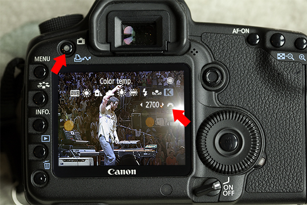
Here’s the trick to help you decide live how to achieve mood-rich White Balance in the Canon 5D Mark II.
- Enter Live View Mode (video mode) in order to see the Kelvin temperature change on the fly, just like the canned WB settings.,/li>
- Move the back camera control wheel to the K symbol, then the screen prompts you to turn the front wheel to see the entire Kelvin range change before your eyes.
- No need for a color temperature meter or extra time and hands to test.
- As an additional tweak, refine Tint by setting a few points of green or magenta on the Color Correction grid that is accessed in the menu under WB Stift/Bracket.
- Move on to Picture Styles to set variations in Sharpness hard to soft, Contrast harsh to mild, Saturation dull to brilliant and Color Tone red to yellow.
I advocate that White Balance manipulation should be considered of equal or greater importance than story telling content, composition and audio capture. I feel that lighting color tone creates the initial visual impact of your production, and only after that impact do the other must-haves come into play.
Click here for an excellent, brand new Canon video tutorial that shows visual comparisons and how-to’s in setting Kelvin White Balance, WB Shifts and Picture Style Presets. This will make it easy for you to adopt the cinematic techniques that have long been hidden secrets.

